
 Mary Collins
We’re keenly aware of how important mobile layout is when focussing on the key content and end goal users want to experience. To help with this we have gradually adopted the mobile-first strategy in our approach to wire-framing and UI design, and, in particular, mobile navigation.

For the past few years, it feels like the accepted solution to handling the main website navigation on mobile has been to hide it with what’s called a “burger menu” typically 3 lines or three dots that indicate a hidden menu. We create a nice burger icon, a slick animation to reveal the full menu… lovely stuff! It looks clean and tidy, and all of the “messy” stuff is hidden away in a drawer.
“a combo navigation is 1.5 times more likely to be interacted with than a fully hidden menu”
However, as we’ve been focussing more and more on UX principles here in the studio, and the science behind users actions, we’ve zeroed in somewhat on the specifics of a mobile navigation, and the best way to handle it from a user experience perspective rather than an aesthetic perspective.
Out of Sight, Out of Mind.
Studies show that hidden navigations are far less discoverable than visible ones. Sounds obvious, but it is critical.
On a mobile view, unless your main site navigation is very concise (2/3 links), it’s unlikely that you’ll be able to have a fully visible navigation. The usual design pattern here would be a combination of visible and hidden, i.e. showing your key navigation items at all times, hiding secondary navigation items under a “more” menu.
Statistics show that a combo navigation is 1.5 times more likely to be interacted with than a fully hidden menu.
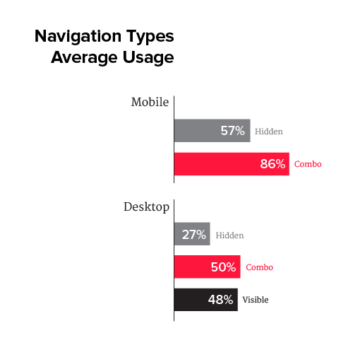
We wouldn’t recommend a hidden/burger navigation on desktop screens (you should have enough screen real estate to accommodate a visible menu here), but stats show that hidden menus are half as likely to be interacted with on Desktop than visible navigations.
In Practice.
Taking these statistics and the best way to address them will depend on your use case. While it’s unavoidable that hiding the navigation will have detrimental effects on its usability, perhaps the design already accounts for this, and CTA’s for the main areas of your site are clearly visible within page content.
In fact, if your user needs to access the menu in order to access a key area of your site, then that’s a problem in itself. Your website content should allow for multiple entry points into key areas of your site.
Take an e-commerce site as an example. The end goal here would be to guide the user through a purchase seamlessly. To that end, the homepage should have products displayed, and/or a clear CTA to the shop, outside of the navigation entirely.
So once you’ve made sure that your main site sections are accessible by other means, it’s time to look at the menu. As it’s unlikely you’ll fit everything in, how do you choose what to show and what to hide?
If your website isn’t task orientated (i.e. e-commerce/register etc.), your site’s analytics would be a great place to start. What pages get the most traffic? The most conversions? Let the users tell you what areas they want access to quickly and fuss-free.

On this site, for example, we identified that our Work and Contact pages were the most visited, and where most time was spent. So we’ve included those in our visible navigation. It was also felt that Expertise was a key site section that we wanted users to be able to access without fuss, so Expertise was added to the visible navigation also.
This combo navigation appears on 320px screens and below, so small / older handsets (less than 10% of today’s mobile users). As our Main navigation contains 5 links, we chose to make all links visible where space allowed on larger handsets.

We’ve noticed positive results since changing from a fully hidden mobile navigation to a combo nav. Comparison year on year, within a 3 month period, we have recorded a 10.4% increase in users visiting the Expertise page from our homepage since we switched to using a visible mobile navigation.
If you feel your mobile navigation isn’t performing as well as it could, let us perform a usability audit and guide you on improving it. Get in touch here.


 Graham Carroll
 Gavin Duff