
Imagine meeting someone for the first time, they found you confusing and had trouble understanding you and answering your questions. They might walk away from the engagement thinking you were complex, inarticulate, demanding and robot like. Not a great start, first impressions last.
Online forms are what connects many businesses to their customers. It’s often the first contact customers make, so we should make a good impression and keep the engagement simple, logical and as human as possible.
Form design is one of the cornerstones of UX and conversion rate optimisation (CRO). This is the point of conversion for many campaigns where marketing teams spend a lot of time and money on driving potential customers towards buying their product or service. If a user gets this far, the chance of conversion if high, so it’s important we remove as much friction as possible.
How can I make forms more effective?
A user will look at a form to see if the effort matches their motivation. A quick glance will tell them if the process is going to be easy or not. A poorly designed form will give the user a perception of complexity, even if this is not the case.
If there are a lot of fields, use multi-step forms to spread them over a number of pages, group related fields into logical sets like “your details’, ‘your booking’ and ‘payment’ — we call this chunking, or dividing fields into semantic groups.
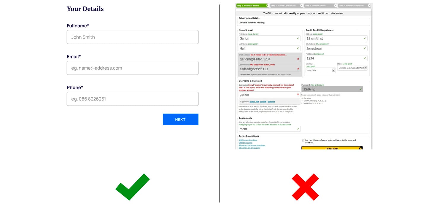
What information should I ask for on a form?
Only ask for the information you really need. Think about the data you are asking for, if it is all 100% necessary and within GDPR guidelines.
What you are asking for should make sense to the user based on what they are buying, they will already have an expectation of the data you need. Do you really need the users date of birth for them to buy a pair of socks?
If the user doesn’t understand why you are asking for personal information they may not complete the form. If you have to ask for sensitive or unexpected information, clearly explain the reasons why.
Reducing the amount of data you ask for will save users time and make them feel more comfortable.
What is best practice in form design?
There are dozens of best practice design conventions that make forms easier to fill out and increase conversions. I’ll cover some of the main ones below.
Use a single-column layout
Give your form a simple vertical flow, don’t have the users eyes zig zagging all over the screen. Multi-column form layouts can be prone to misinterpretation, users can skip fields where they actually have data to input because they do not notice them, especially on mobile.
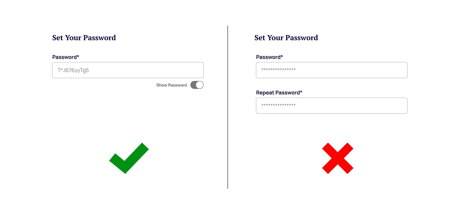
Don’t ask users to repeat fields
We’ve all come across it, we’re asked to enter a new password twice to verify it and what we end up doing is copying and pasting the text into the second field, it defeats the purpose. Instead of asking users to confirm a password, let them see it, you can use a toggle to display the password as they type.
 Avoid Drop-down Menus
Through years of usability testing we have found that using drop-down menus for the wrong input types can lead to slower form completion time and validation errors which increase the likelihood of form abandonments. In general, avoid drop-downs when there are fewer than 5 or more than 10 options.
Radio buttons or checkboxes work well for less than 5 options and if you have over 10 options like a choice of country, try using an open text field with auto-complete, it saves the user time and frustration.
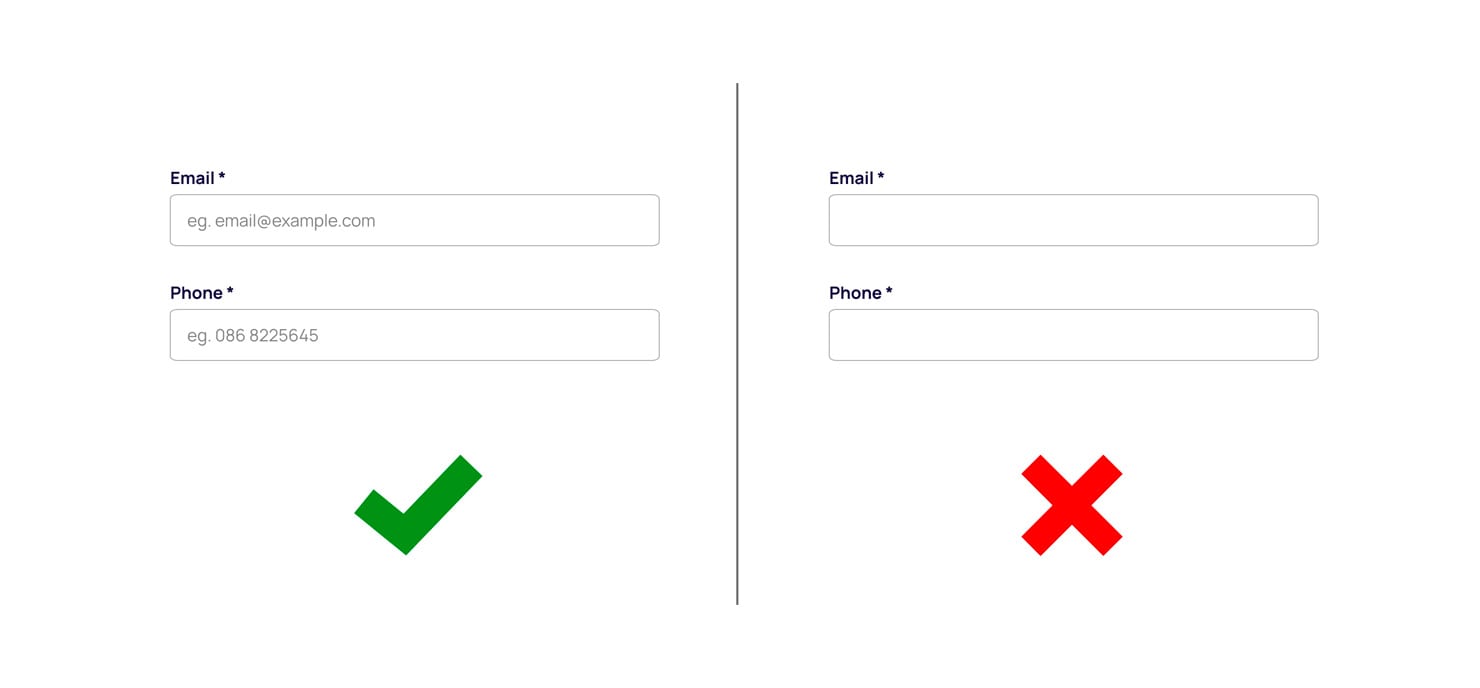
Use Placeholders
Don’t assume the users know what information you are asking for on each field, give them a hint, this should help with any questions that might arise.
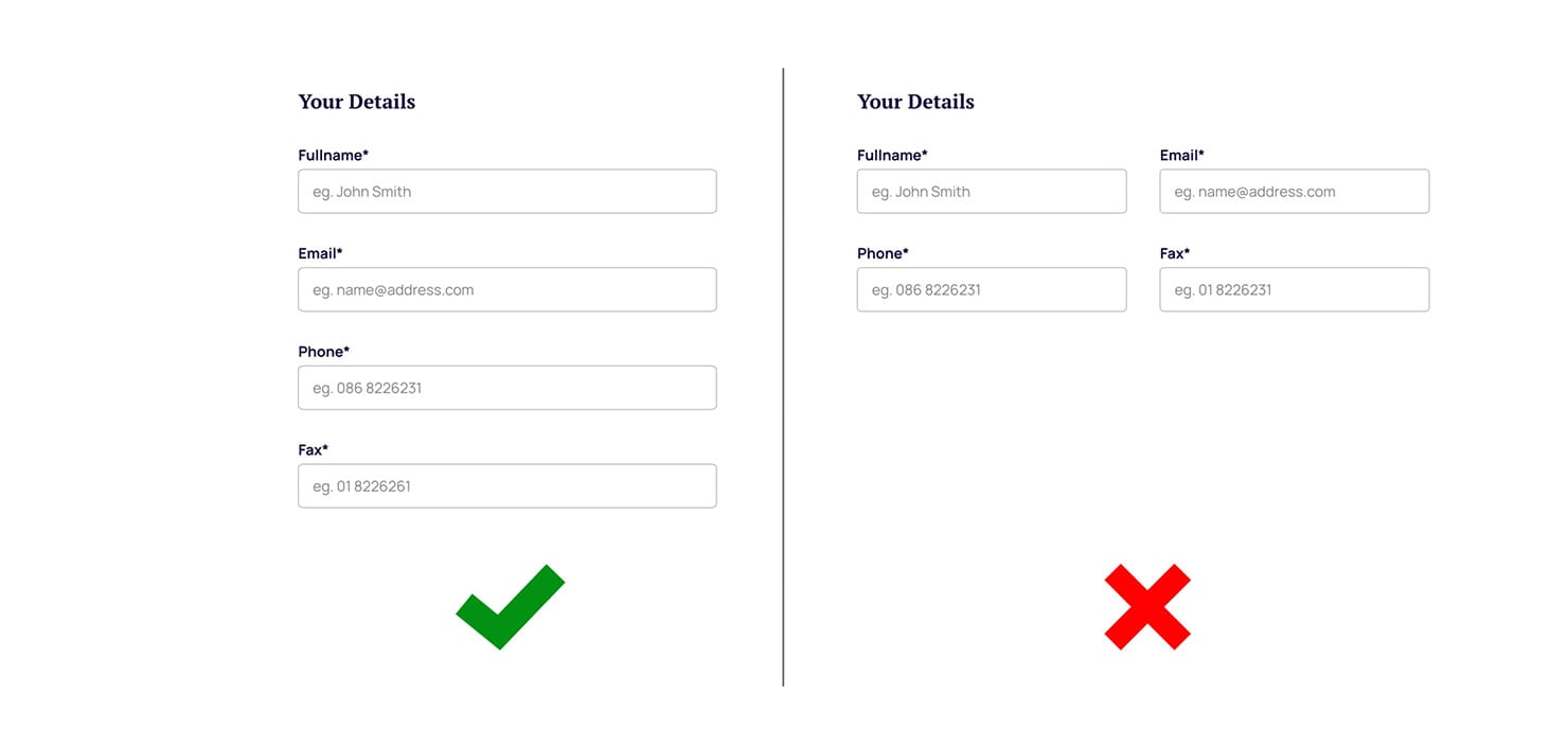
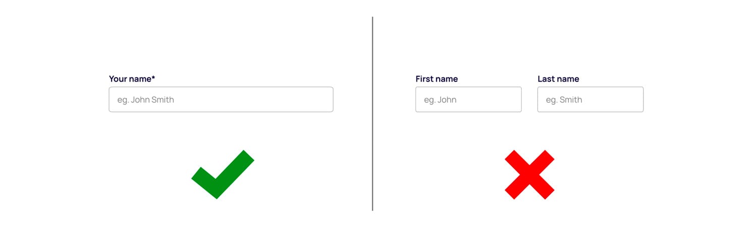
Try not to split fields
It should not be necessary to split fields like First name and Last name, one field for both will do, this will save the users time and clicks. If you need to split them later this should be easy enough to do in the database or even in Excel.
Language
One area of UX design that often gets overlooked is copywriting, designers are usually not good copywriters (myself included). UX copywriting makes experiences more efficient, by helping readers navigate their way to their desired outcome. Copy should be concise, friendly and written in plain English. It’s UX design, but with words. When it comes to error messages and form validation don’t be a robot, help the user by keeping the copy clear and easy to understand. Help the user solve the problem.
I could go on —
- always mark mandatory fields with an astrix
- align labels top-left for best readability
- don’t use CAPs
- use conditional logic to shorten your forms
- use autofocus on active fields…
What is good UX for submitting and providing form feedback?
If the user has gone to the trouble of completing your form, you need to give them good feedback, reassurance that it worked and be clear about what happens next.
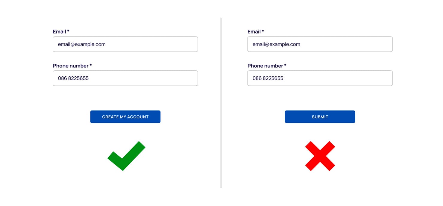
Use clear and obvious action buttons
Don’t make the mistake of being a robot again by putting a label like ‘Submit’ or ‘Send’ on the action button, this tells the user nothing about what is going to happen. Set the expectation, tell them what they are about to do. This clarity is essential for great calls to action, they go a long way in making a form more compelling and trustworthy.
No one enjoys waiting
When it comes to loading and submitting data, your form should be lightning fast. Make sure you have a well resourced server and use Google Lighthouse to check your forms performance and accessibility.
If you have to keep a user waiting after submission, provide some feedback to show them something is happening behind the scenes. A simple animation will do this while distracting them from the time passing. You can also use some clever animations to keep them amused and the time will pass quickly.
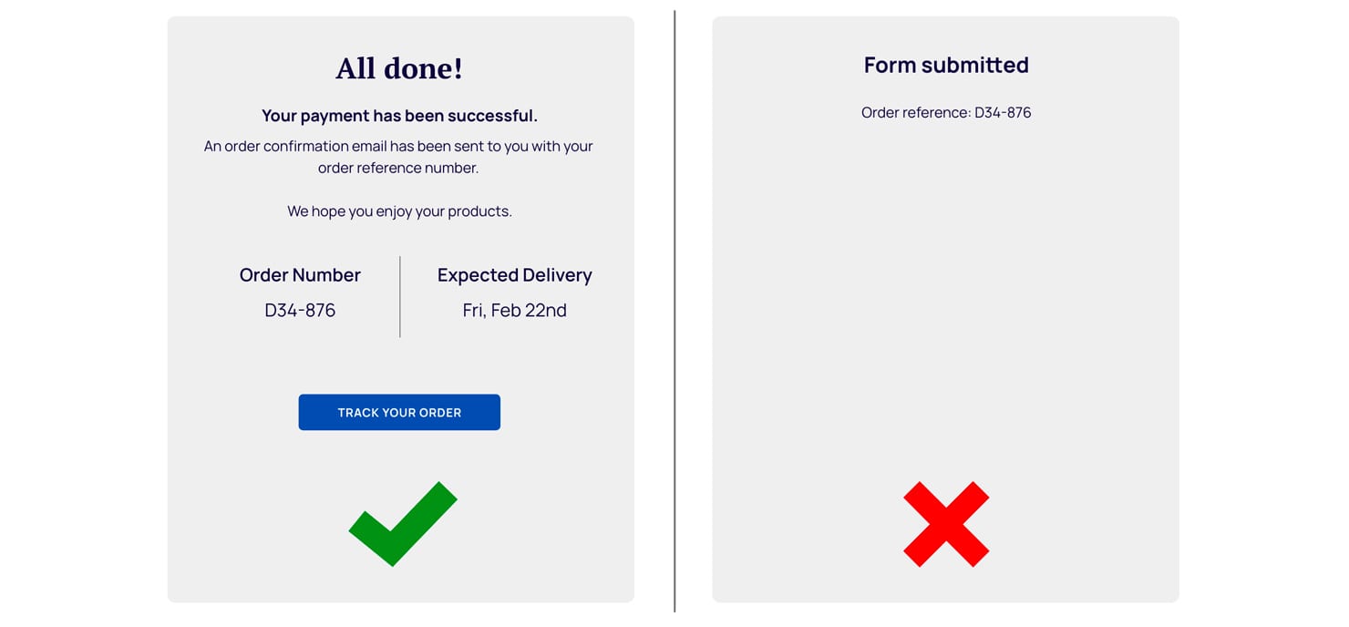
Celebrate success
When a form has been submitted, tell the user it worked (or not). Show them a message of success but also let them know what happens next. Will they get an email? Will their concert tickets be posted to them? — set the expectation.
What is the number one thing I can do to improve the UX of my forms?
None of this is rocket science but all of it will go a long way to maximising your online conversions. You can take all of our advise but the one thing that all UX comes back to in the end is test, test, test! If you don’t carry out usability testing, you won’t know if a form is working to its full potential.


