Dark user interfaces (UI) have become very popular with users over the last few years. We have seen some of the most popular apps and services like Android, MacOS, Spotify, Instagram, Gmail and Netflix that have been designed with a Dark mode in mind. Let’s talk about what factors should be considered when choosing between a dark UI vs a light UI and what is best for your users.
As designers, we face the dilemma of whether to use a dark UI or light UI not only when creating a product but also when using an application on your phone. We can all agree that a dark UI looks cool and stylish. However, using dark interfaces can be the wrong way to go for your users.
Things to consider when making a decision between a dark or light UI
Quite often, the decision to opt for a darker UI is based on personal preferences rather than a solid understanding of what is right for the product. But the decision to choose between a dark UI or light UI should be well-thought-out. Instead of assuming what might be good for your product, answering the following questions might be the right place to start: What is the purpose of your content? Is it going to be a more visual product or a text-heavy one?
The background you choose for your layouts will influence the readability of your product. Readability should be considered above all else, in particular, if the text is the most important part of the content on the website or the app you’re working on. Simply put, poor readability is one of the main reasons for bad usability.
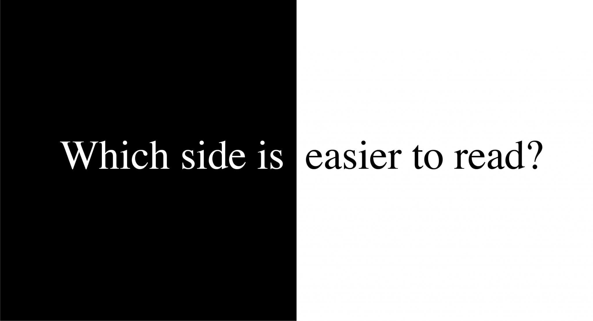
Is it harder to read on a dark UI?
The amount of text on a website is also a critical factor for your background decision. Lighter backgrounds are prefered for large bodies of text. Especially when users are likely to stay reading for a longer period of time. That’s why text-heavy news websites and blogs usually use a white background.
A dark UI can be a good option for highly visual projects that don’t involve a lot of reading. In this case, it’s preferable because such UI brings the focus to the visuals. For cases when you want users to focus on a particular area and admire its design, a dark background will allow you to create a distraction-free layout and keep user attention on the item.
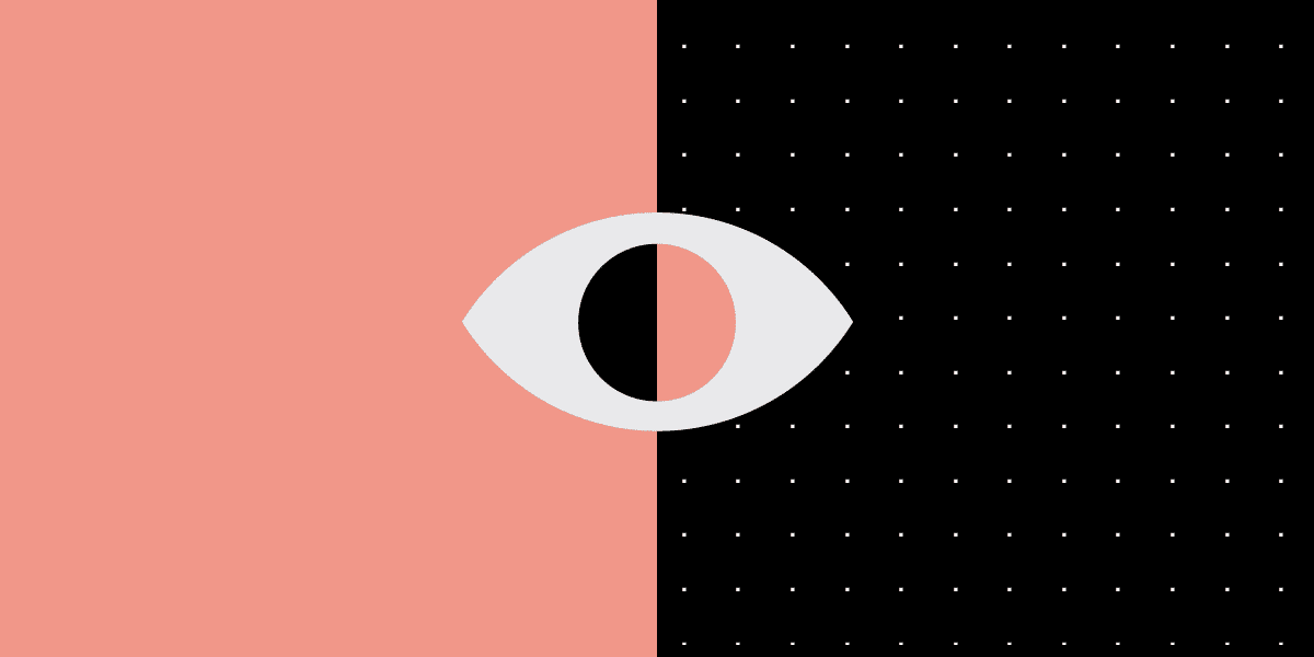
Which is better for your eyes – light or dark UI?
Although dark mode can help minimize eye fatigue, the glare from your screen can still be a problem. Dark mode can be very helpful for people who are especially sensitive to light. Yet, for others, the setting can make it even more difficult to manage.
Everyone’s eyes are different, people with certain kind of colour blindness may find it harder to use. It may also be more difficult for people with astigmatism (when your eyes do not focus light evenly, causing blurred vision from a certain distance). They may find it harder to read white text on black than the other way around, part of this has to do with the light levels.
The decision to use dark mode comes down to how it makes your eyes feel. If you feel it helps you, go for it.
User Environment
When we talk about the user environment, we’re not just talking about where the user is using the platform, but also when. As you would probably expect, dark interfaces are ideal for night-time or evening environments, whereas lighter ones are suited for the daytime. The harsh bright light of a smartphone can cause discomfort when viewed in a darkened room, and the muted aesthetic of a dark UI will not show up as well in brightly lit areas.
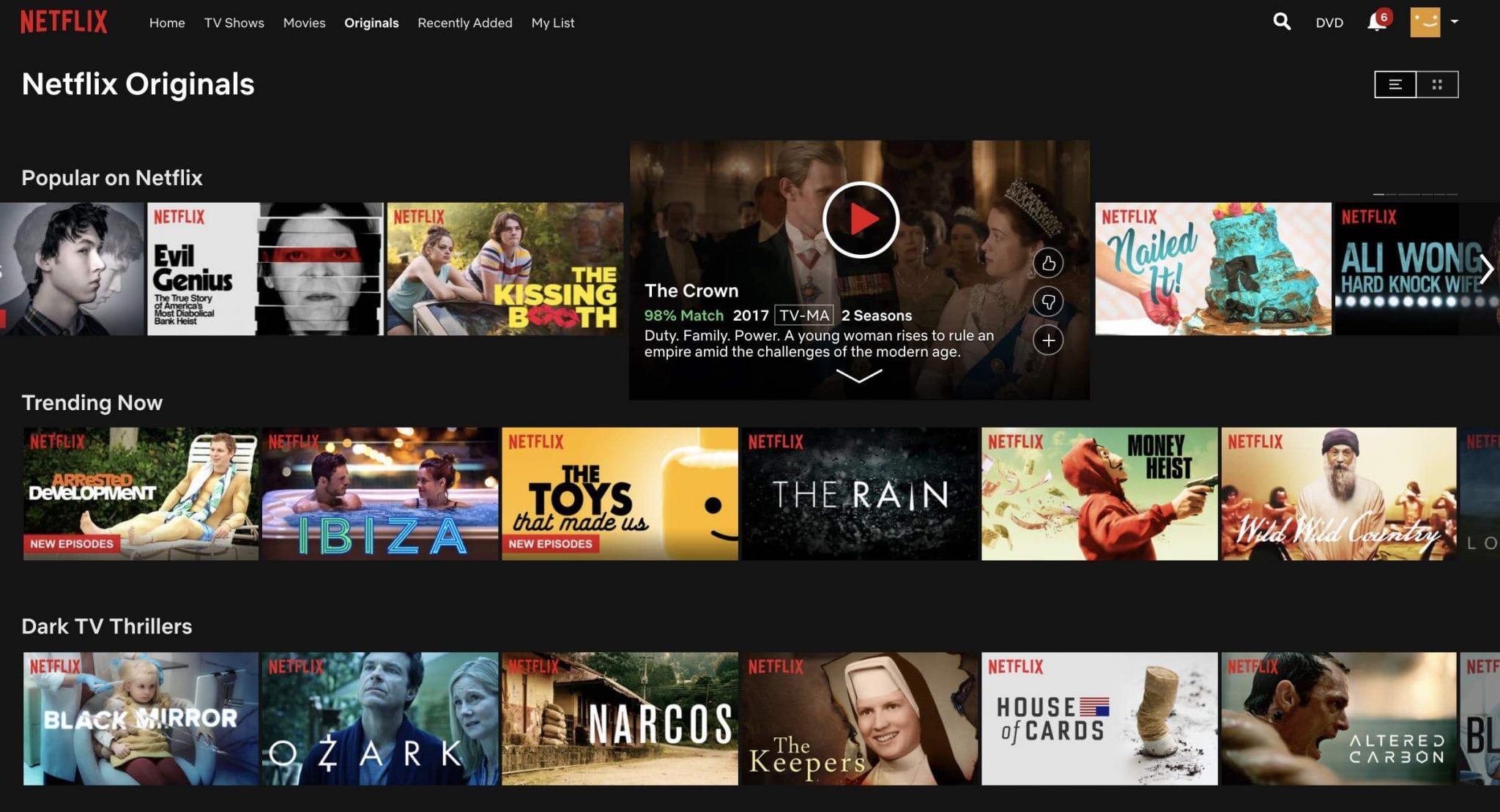
The vast majority of entertainment apps tend to opt for dark-themed UI designs and for a good reason. Most entertainment-related activities occur in the evening. Netflix or Amazon Prime is usually watched at night time so we can all say that a dark UI works well in dark environments.
What style does your target audience prefer?
The first step in designing a UI for your product is to know your users and their preferences. Different users have different tastes and different expectations. It is essential to start with researching the competition. Research of close competitors will give you an understanding of which design solutions have already been applied by other players on the market, as well as the factors influencing design solutions.
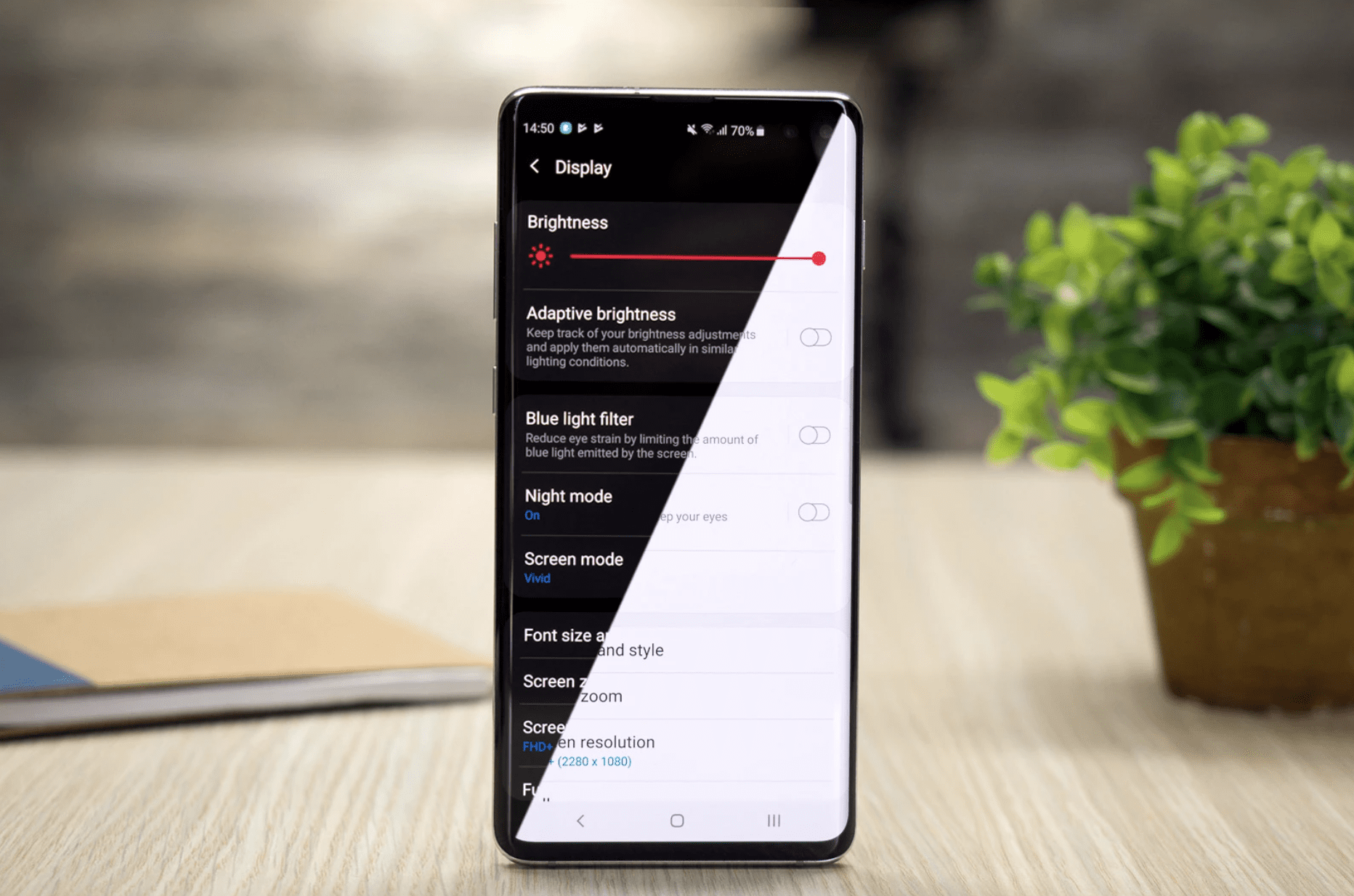
Toggling between dark and light mode
Some companies have adopted the approach of letting the system decide for you when to turn off and on the dark mode, basically, switching between the two when it thinks is best. Another approach is to let the user make up their own mind and have control with just the click of a button based on their needs. That said as a designer, there is already plenty to be done when it comes to designing a site in normal mode, without the addition of a whole new site too. While yes, the core elements are the same, it will still need to be re-worked and altered to sufficiently adapt to dark mode.
When a dark UI works well
So here’s a shortlist of when a darker UI should be used:
- Whenever there are more visuals/videos to watch and little text
- When there are few elements on the design and there is a good bit of white space
- When you want to watch a movie or play video games
- Apps that require less effort on reading
When to stay away from a dark UI
- When your website will be used mostly in the daytime (This can be informed by your analytics and user research)
- Products that most of the content is based on reading a lot of text websites or apps that include a lot of elements on the screens
- Whenever you need to use different colour elements throughout the website or product
- B2B websites that include a lot of components, widgets and forms
Dark or light?
A simple question with a much more difficult answer. The decision to jump into the ‘dark side’ should be approached with care. Before making a final decision, we should clearly understand not only the benefits but also the downsides of dark interfaces and whether or not it suits the content we would like to deliver. Even when we think that dark layouts can have a lot of benefits for products and websites, designers should understand their users and take them into consideration when designing.