
Whether you run a business that has an app or website that is either core to, or part of the sales process you will want to keep a close eye on the conversion rate on an ongoing basis. Is the software, content and interface doing its job? Can users find the content and functions they need and are they converting? How can it be improved?
It may be that you don’t know if your website or app needs minor updates or a major redesign, best not to make assumptions around this as it can be costly. There’s no such thing as a perfect user experience, there’s always room for improvement and discovering where the improvements can be made is where a UX audit can be invaluable.
Research carried out by Forester in 2017 shows that, on average, every €1 invested in UX brings €100 in return. They also found that a well-designed user interface could raise your website’s conversion rate by up to a 200%, and better UX design could increase conversion rates up to 400%.
The Process of a UX Audit
A UX audit will go through a series of steps that will help uncover any usability issues. This will provide actionable recommendations that will help eliminate any issues and improve the overall user experience and conversion rate. The process of a UX audit will vary depending on the goals, budget and time allotted. This could range from a day or two to several weeks. During a UX audit, the auditor uses a variety of tools, research methods and metrics to find out where the software is or is not working. The most effective UX audit would include quantitative and qualitative research that involves users, this would include usability testing, interviews or surveys.
As part of a UX audit, a UX professional would usually carry out what is known as a heuristic evaluation of the software. User experience pioneers Jakob Nielsen and Rolf Molich published an article in the early 1990’s which contained a set of principles, or heuristics, that industry specialists soon began to adopt as a benchmark to systematically determine the usability of an interface. In the absence of enough time or budget for user research, a heuristic evaluation may be central to the audit process.
10 Usability Heuristics for User Interface Design
As experts, we go through a checklist of criteria to find flaws and areas that can be improved based on the following principles.
#1: Visibility of system status
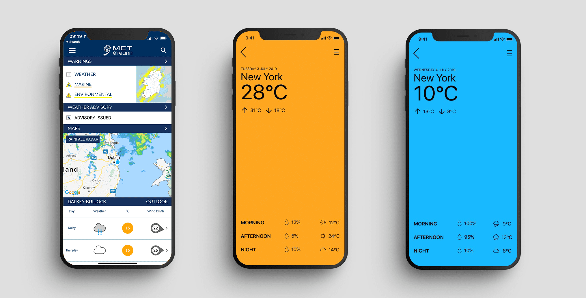
The design should always keep users informed about what is going on, through appropriate feedback within a reasonable amount of time.

A progress bar tells the user something is happening and indicates how long it might take. This builds trust and patients.
#2: Match between system and the real world
The design should speak the users’ language. Use words, phrases, and concepts familiar to the user, rather than internal jargon. Follow real-world conventions, making information appear in a natural and logical order.
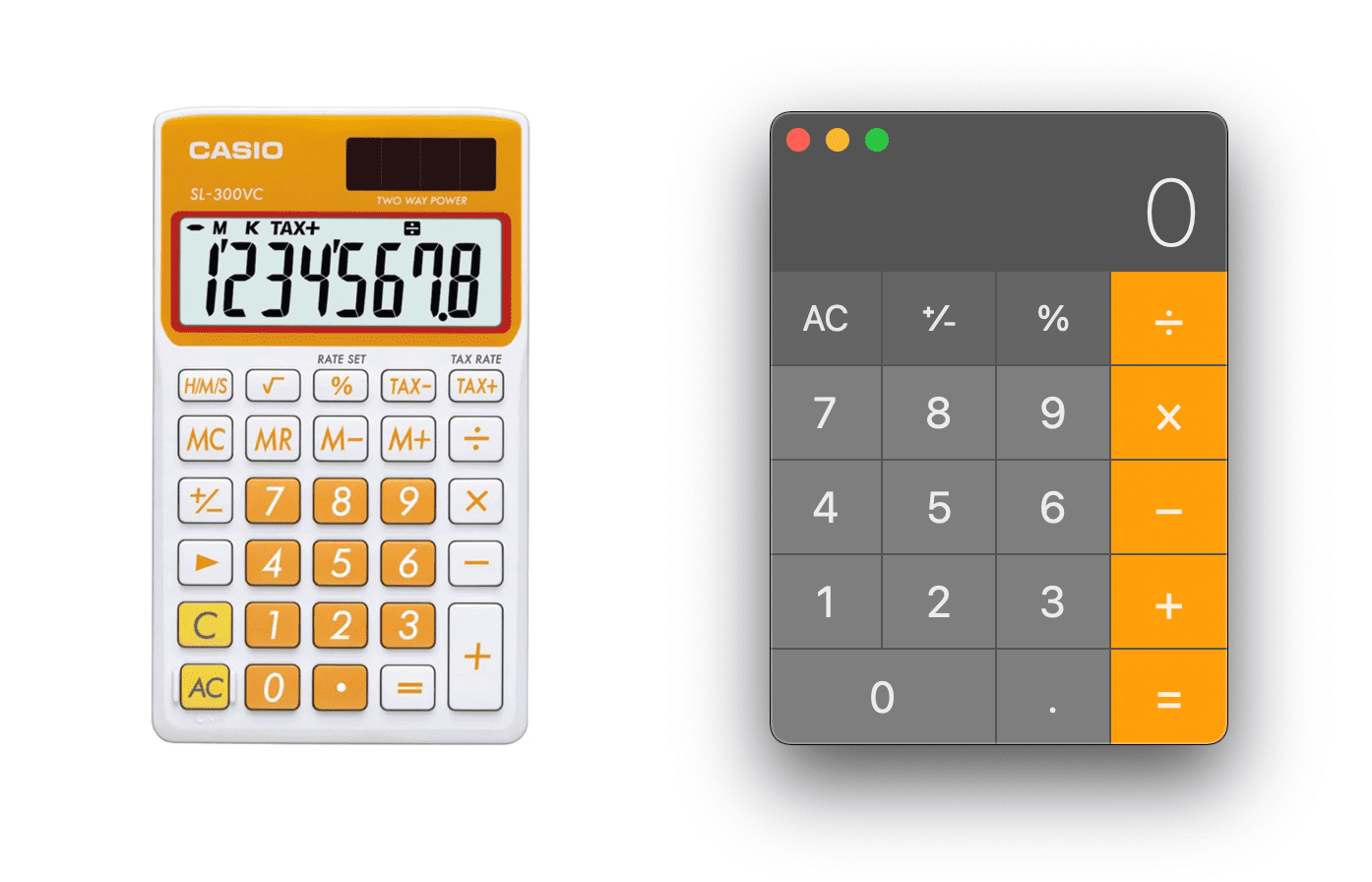
Familiarity with something in the real world, the Mac calculator is not too far from the old Casio model we all used in school.
#3: User control and freedom
Users often perform actions by mistake. They need a clearly marked “emergency exit” to leave the unwanted action without having to go through an extended process, a bit like the undo command that is common on a PC.
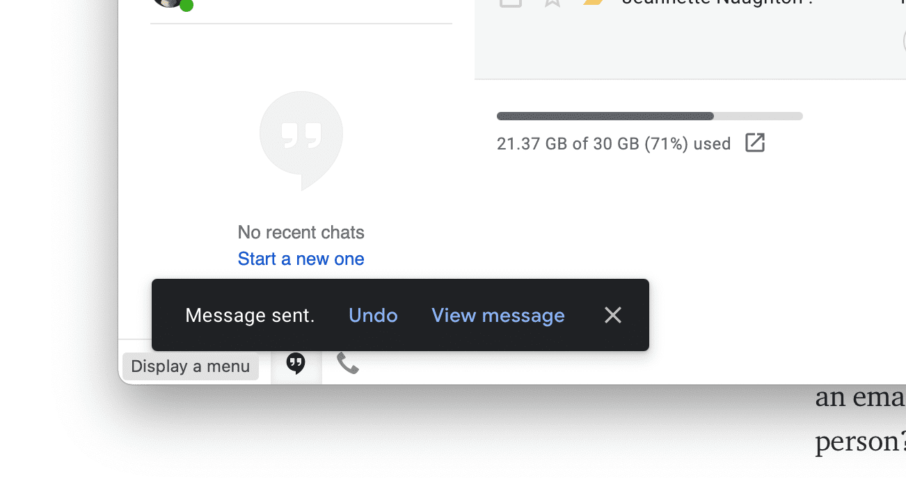
The undo feature Google added in Gmail gives the user 5 seconds to stop an email from sending (after they press send), might come in handy!
#4: Consistency and standards
Users should not have to wonder whether different words, situations, or actions mean the same thing. Follow platform and industry conventions and reduce learning.
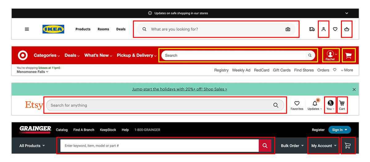
Don’t reinvent the wheel, users will find familiar interfaces that follow convention much easier to use.
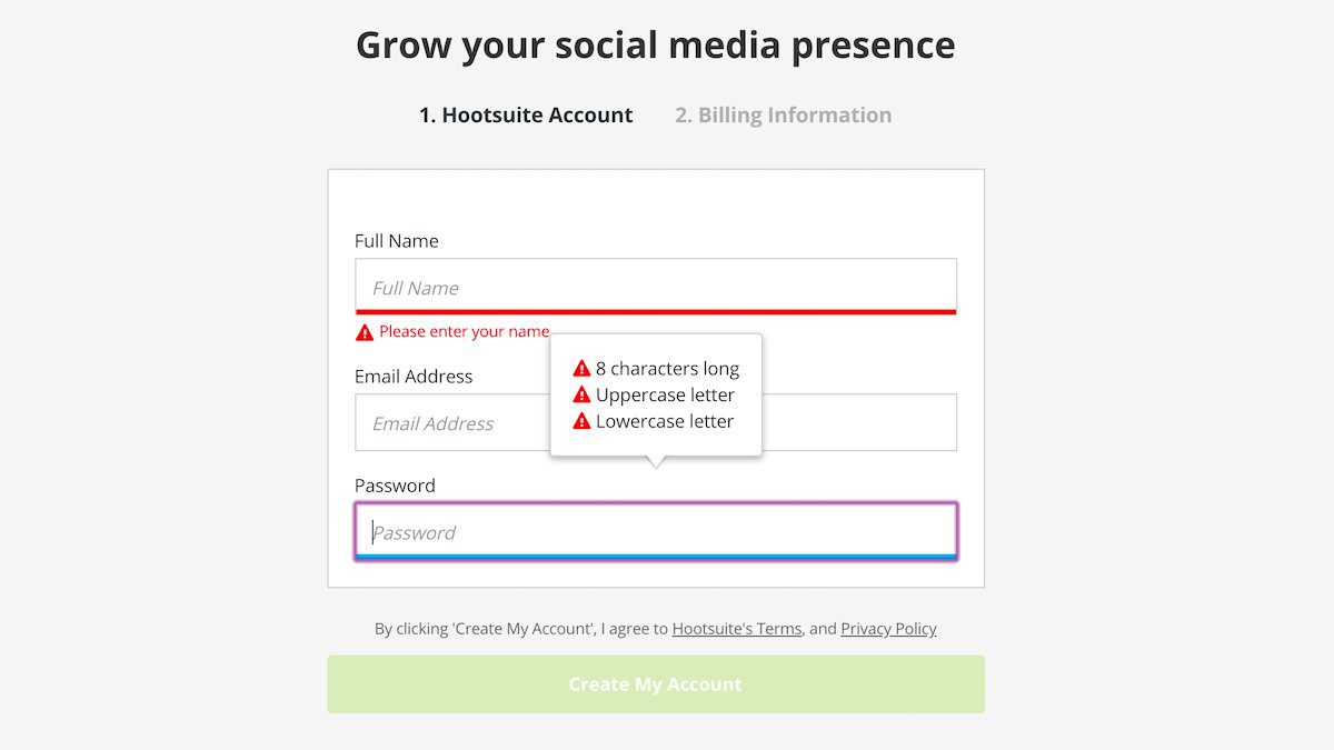
#5: Error prevention
Good error messages are important, but the best designs carefully prevent problems from occurring in the first place. Either eliminate error-prone conditions, or check for them and present users with a confirmation option before they commit to the action.
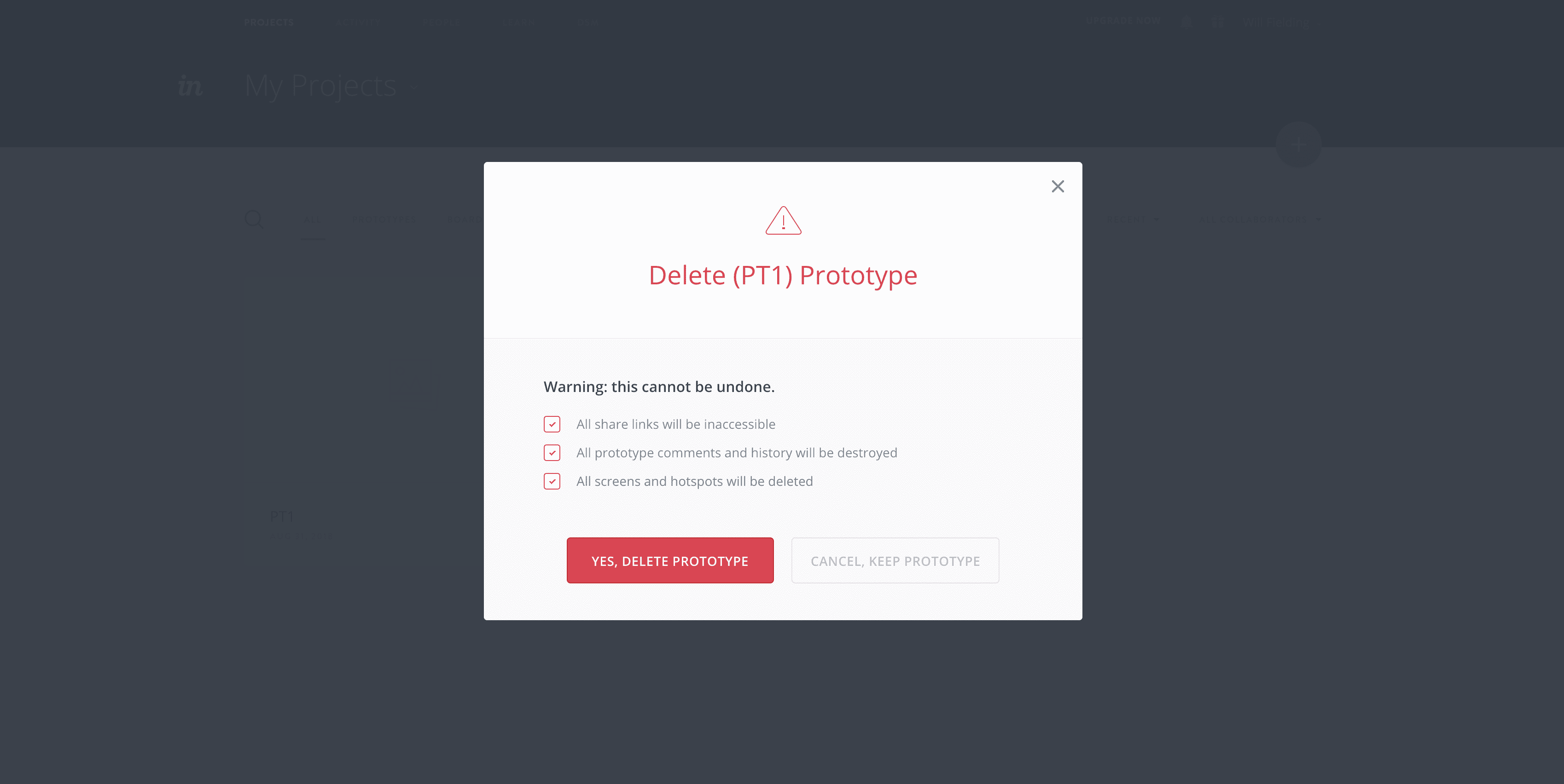
Users need to fully understand the outcome of their actions.
#6: Recognition rather than recall
Minimise the user’s memory load by making elements, actions, and options visible. The user should not have to remember information from one part of the interface to another. Information required to use the design (e.g. field labels or menu items) should be visible or easily retrievable when needed.
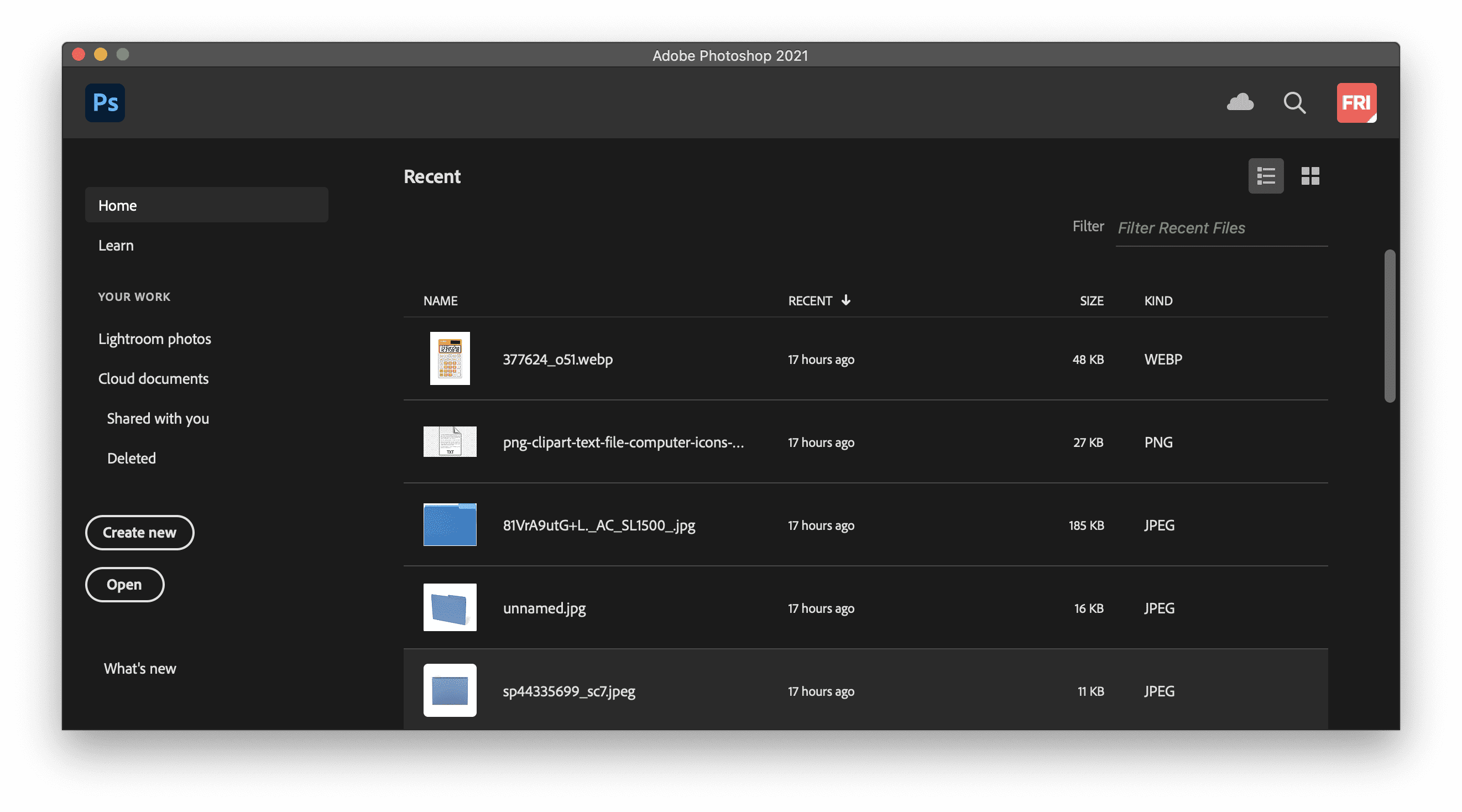
In Phtoshop, Adobe present the users with a list of recently worked on files, this helps the user from having to go rooting for them.
#7: Flexibility and efficiency of use
Shortcuts — hidden from novice users — may speed up the interaction for the expert user such that the design can cater to both inexperienced and experienced users. Allow users to tailor frequent actions.

Payment applications like ApplePay and Google Pay help users quickly pay for something online without having to enter their payment and personal details again and again.
#8: Aesthetic and minimalist design
Interfaces should not contain information which is irrelevant or rarely needed. Every extra unit of information in an interface competes with the relevant units of information and diminishes their relative visibility.
Less is more. Users like consuming information at a glance. Clean design minimalist design helps with this.
#9: Help users recognise, diagnose, and recover from errors
Error messages should be expressed in plain language (no error codes), precisely indicate the problem, and constructively suggest a solution.
Help users solve a problem, give them as much informartion as posisble without technical jargon.
#10: Help and documentation
It’s best if the system doesn’t need any additional explanation. However, it may be necessary to provide documentation to help users understand how to complete their tasks.
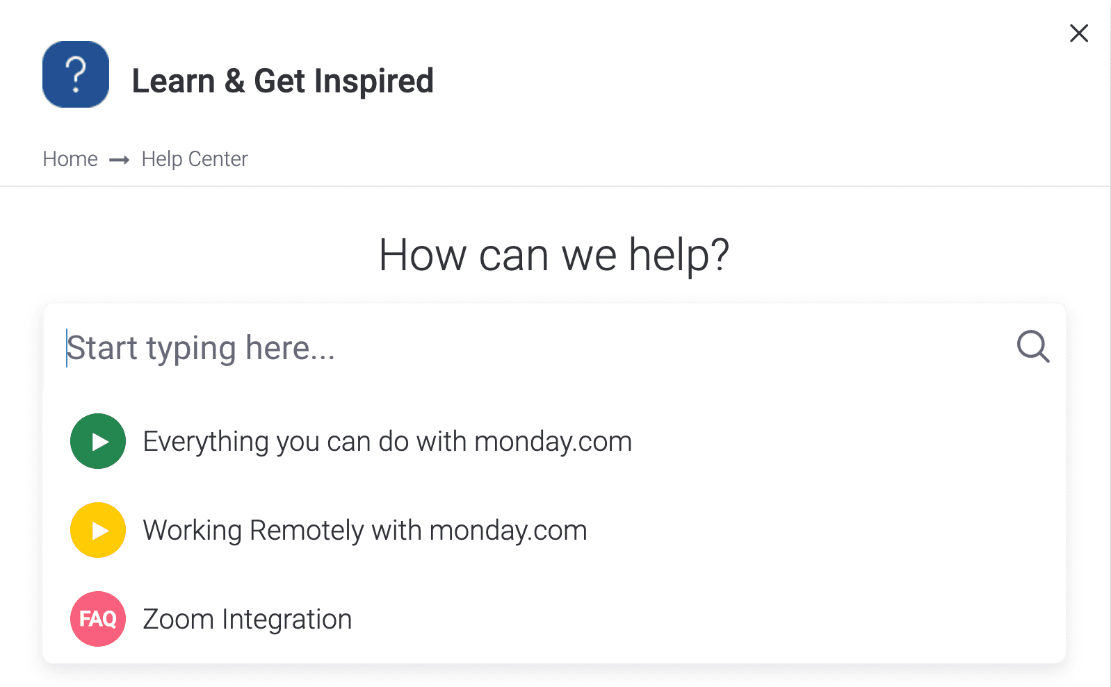
A smart, predictive search can help users find answers to their questions quickly.
The Output of a UX Audit
A UX audit should also take into account the content, layout and the user flow through the interface and uncover any blocks or hurdles that users may have to get past in order to complete a task.
There is no universal format for a UX audit report, each one is tailored to the process employed for the project. It may consists of some or all of the following.
- Usability review / heuristic evaluation
- Information architecture review
- Data analytics
- Revised User flows
- Review of language, clarity, and Calls to action
- Conversion optimisation
- Content review
- Visual design review
- Suggested updates mapped out in a priority matrix
At the end of a UX audit, you should receive a comprehensive report with clear and actionable recommendations and advice. The key suggestions from this audit can be mapped out in a priority matrix that will identify the quick wins or low hanging fruit that will have the highest impact on UX with lowest amount of design or development effort — we start from there and work our way through the findings to maximise ROI as quickly as possible.
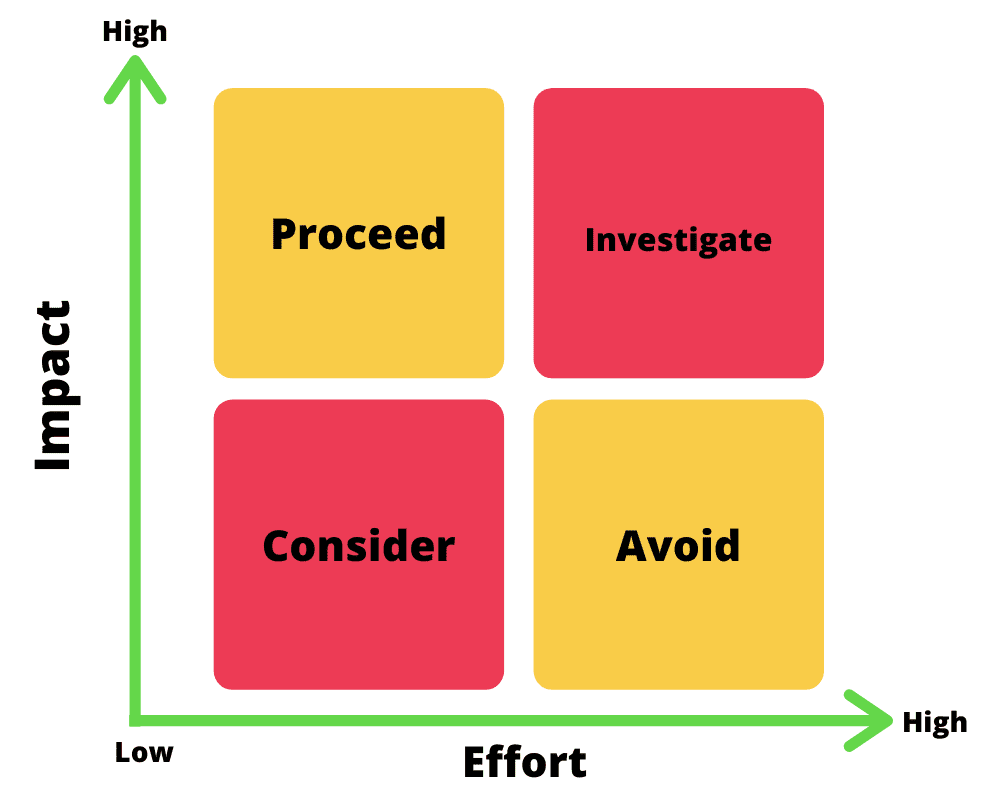
Priority Matrix
A UX audit is an essential process for any software product, app or website. A well-executed review will help businesses fix problems quickly, improve retention and boost conversions.
Interested in running a UX audit on your app or website?
Please, get in touch to see how we can help.


