
 Dave Jackson
Updated July 2020
One of the most common things I get asked about by clients is why a website might not look the same on different screens. Its something that I have always found challenging to explain in a simple and concise way. I understand the subject in great detail but I often struggle to articulate it in a way that a non-technical person can understand. So I’m using this blog post to try and work out a way of explaining screen resolution without losing you in the second paragraph.
To understand resolution you need to understand how a screen works. Screens are made up of thousands of tiny dots all bunched together called pixels, each one has the ability to change colour and when you zoom out all the dots joined together make up an image.
Screen resolution is the measure of the number of pixels a screen can display. This would be measured by width and height. For example, a screen that has 1,024 pixels horizontally, and 768 vertically would have a resolution of 1,024 x 768.
These days we have many different screens sizes all with different resolutions – TV’s, desktop monitors, laptops, tablets, mobile phones and even smart watches. Its a mine field.
Forget the physical size of a screen
So the first thing you need to understand about resolution is that the physical size of a screen bares no relation to the screens resolution. You can have a 27” HD TV screen that has a resolution of 1,440 x 1,080 pixels or a 5.8” phone that has a higher resolution of 2436 x 1125. Whats important is the number of pixels the screen can display.
You may have a 27” Dell display and I have a 27” LG display, they can have different resolutions. The Dell display has a resolution of 1,920 x 1,080 and the LG display has a 5k resolution of 5,120 x 2,880. While they both have the same physical size the LG display has more pixels so it can show more detail.
Your website
So this is where it becomes relevant to most people who ask about computer monitors. Most websites we design have a maximum width of about 1,900 pixels — if your screen has a larger pixel width than 1,900 you may see blank space to the left and right of our website depending how how the site was coded. If your screen has a width lower than 1,900 you won’t see any space on the left and right.
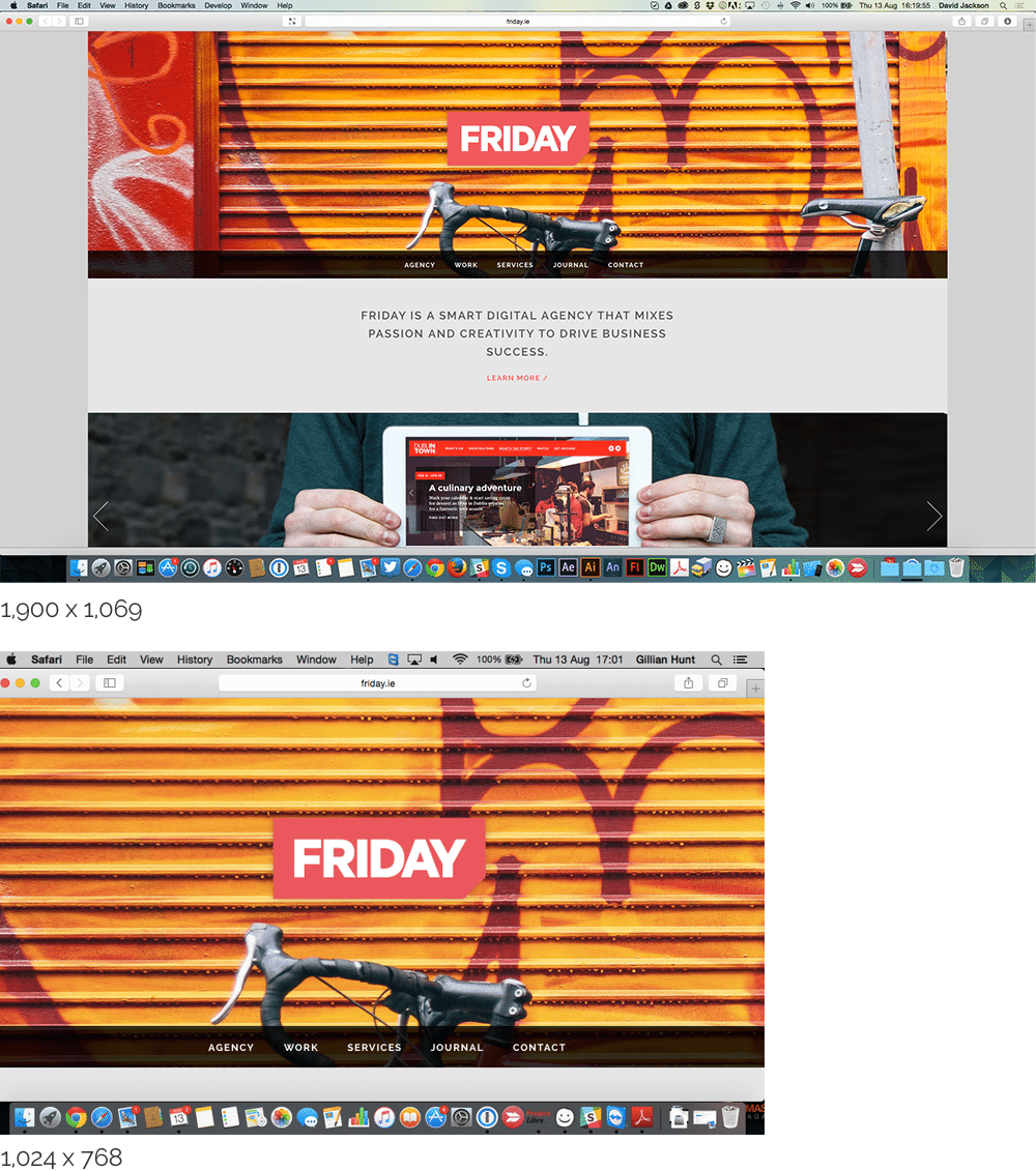
The screenshots below show our website on 2 different displays. The top one has a high resolution of 1,900 x 1,069 and below is a smaller 1,024 x 768 display. You can see the top screen shows about 45% more website real estate and the website has blank space on the left and right as the site was designed to work on maximum width of 1,500 pixels. The lower resolution monitor has less real estate to display information and the website adapts to the lower width of 1,024. (I don’t want to over complicate things by going into responsive websites but you can read more about that here in Jonno’s post from a while back)
There’s more?
Now, if the year was 2010 we could leave it there, simple right? Well things have changed, and I encourage you not to read on if you are already confused, the previous paragraph is probably all most people need to understand. I’m going to ramble on because I’m a bit geeky like that.
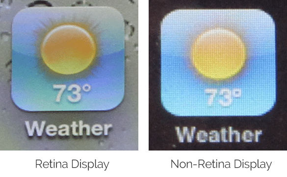
Pixel density has now been thrown into the mix. Until recently most screens would display 72 dots per inch or DPI but now we have screens with a much higher pixel density, for example the iPhone 6 has has a pixel density of over 400 DPI, this is what is known as a Hi-DPI or Retina screens, a marketing term coined by Apple because the human eye is not be able to discern the individual pixels at a normal viewing distance.
The goal of Retina or Hi-DPI displays is to allow a highly crisp display of text and images, allowing computer screens to rival the smooth curves and sharpness of printed text and photography. Hi-DPI monitors are stunning and a pleasure to work on.
They are not just available on smartphones but higher end Mac’s and PC’s now come with Hi-DPI monitors. Everything looks so smooth and clear but it also means as web designers we need to output higher resolution and vector graphics to take advantage of the extra pixels.
We could go into 4k & 8k TV’s but I think its best we don’t dig too deep or everyone will just get upset.
So did I explain screen resolution in a concise and easy to understand way? Maybe not, I’m starting to wonder if that is possible.


 Jonathan Dempsey
 Graham Carroll