I’m Dave, the UX director at the Friday Agency. Sitting beside me is Gavin and Martin, good guys and both very experienced digital marketing professionals. Naturally, we work very closely together and like to have the occasional laugh at the expense of each other! They provide me with a wealth of statistical information around user behaviour. I like to think I provide them with more attitudinal research-based user insights. This brings up all kinds of great discussions around usability. While we interpret data differently from our own perspectives, we all have the same goal in mind — to gain user empathy through research and not assumptions.
Office banter
A good discussion started last week about the use of title case vs sentence case in both digital marketing and UX design. Before I go into how I think the lads are wrong let me explain a couple of things.
Title case means that the first letter of each word is capitalised, except for certain small words such as articles and short prepositions. With sentence case, only the first word and proper nouns have initial capitals, the Queens English so to speak!
Title case:
Gavin and Martin Think They are Right, Dave has Other Ideas.
Sentence case:
Gavin and Martin think they are right, Dave has other ideas.
Spending a lot of time working in Google Ads, Gavin and Martin need to write attention-grabbing headlines in 30 characters or less. Research has found that using title case for Google Ads is more effective for getting users attention, fair enough. The issue I have is that the lads seem to apply the same logic to almost all titles, subtitles, headings and sub-headings, lists and bullet points. This willy nilly approach upsets me, its all over the place — no rules, no control — it’s literary anarchy!
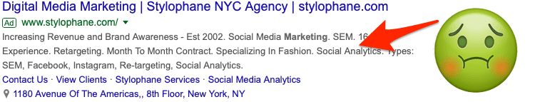
There is no doubt that title case works well online for headings, it gives a visual hierarchy to different text elements and helps guide the reader. You don’t want users starting with a sub-heading. My feeling is that title case works when there is less than 10–12 words, after that it just gets messy and hard to read. To my horror Gavin suggested that sub-titles should also be in title case, this is where I draw the line. There is no way the sub-text legibility in the Google Ad below benefits from being in title case… no way, sorry Gav!
A/B testing
So, being the research nerds that we are, we decided to do some A/B testing around this. We created 2 almost identical Google Ads for our UX services. The only difference was that the sub-title was title case in one and sentence case in the other. We wanted to see which ad had the highest click-thru rate.

Sub-title in title case

Sub-title in sentence case
To our surprise, there was only a 0.5% difference in performance between the two ads in favour of title case, marginal and inconclusive for most but huge for the likes of Amazon. This may hint that title case will grab slightly more attention but doesn’t offer us any insights into legibility. To be fair to Gav and Martin, we do it not because everyone else does — but because it gets higher click-through-rates and therefore more revenue for our clients!
This got me thinking about what the ‘rules’ are around this for marketing or UX. I did a bit of reading on the subject and it seems there are no rules. It’s highly subjective. There is a general consensus that titles do get more attention in title case but the jury is out on whether longer titles or sub-titles in title case are easier to read. Studies have found the difference in reading efficiency between title and sentence case is actually quite minimal. My views might be based on aesthetics, it looks choppy and for me it is harder to read but you may not agree.
Laying down the law
The hypothesis that I offer is that title case has a high level of prominence but the legibility suffers as a result, you’d never read a full book in title case, would you? The use case depends on what you want to achieve, do you want attention or have easy to read text.
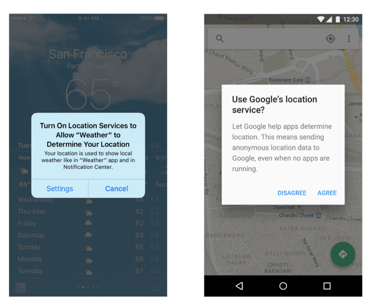
I found a great example below. These are different notification popups on iOS and Android screens. As you can see on the left Apple have a policy of title case on titles while Google uses sentence case throughout. While they are different messages, you can’t tell me the iOS message is easier to read, can you?
While there are plenty of well-established rules for how to use title case, there are few rules about when to use it. Everything seems to be subjective and based on assumption. It’s the wild west out there! Somebody needs to take charge and make decisions.
I am going to do what no UX designer should ever do, I’m going to make the rules based on my own opinions and assumptions. From this day forward I will be known as the self-appointed Sheriff of sentence capitalisation.
Sheriff Dave’s 4 Golden Rules for Sentence Capitalisation
- Only use in main titles
- Only use in titles shorter than 12 words
- Never use in sub-titles, lists, bullets or anything that is not a main title (see point 1)
- Digital marketers may not be the best guide on the appropriate use of title case
Take it or leave it.
What do you think? Am I the Sheriff or are Gavin and Martin entitled to put a bounty on my head?