Compliance often gets lumped in with the tickbox stuff… data protection sorted, cookie banner live, privacy policy pasted in, website’s pretty “accessible”… job “done.”
In reality, website accessibility is what stands between your organisation and a world of pain, protecting both your people and your customers.
But when it’s treated as something one team quietly takes care of while everyone else carries on, the rest of the business never gets to see why it matters or the value it can actually unlock.
Let this sink in… in Ireland, a 2023 audit found that 73% of the country’s top 100 company websites are still inaccessible, effectively locking out around 600,000 people living with a disability.
Why the tickbox mindset breaks accessibility
If accessibility is treated as a tickbox task when designing and building digital products and websites, users will feel the impact. Accessibility is not an add-on. It shapes how people find, read, and use your website.
A common misconception is that accessibility only matters for people with disabilities. In reality, it improves clarity and usability for everyone.
If you want to see the official standards behind all of this, the Web Content Accessibility Guidelines (WCAG) set out what good looks like in detail.
Accessibility is for everyone
Think about real moments. Browsing on a phone in bright sunlight. Ordering a taxi while walking in the rain. Paying a bill on a patchy connection. Using a screen reader. Good accessibility supports all of these scenarios. Accessibility is simply good UX that lifts engagement across every user group.
Reframe accessibility as basic readability. Share this outlook across the team. Build it into your values. Build it into your language. It’s a way of thinking, not just a checklist.
Here are 5 low-effort, high-impact changes you should make to your website right now:
1) Text size and spacing
- Increase body text to at least about 16 px
- Increase line spacing to about 1.5
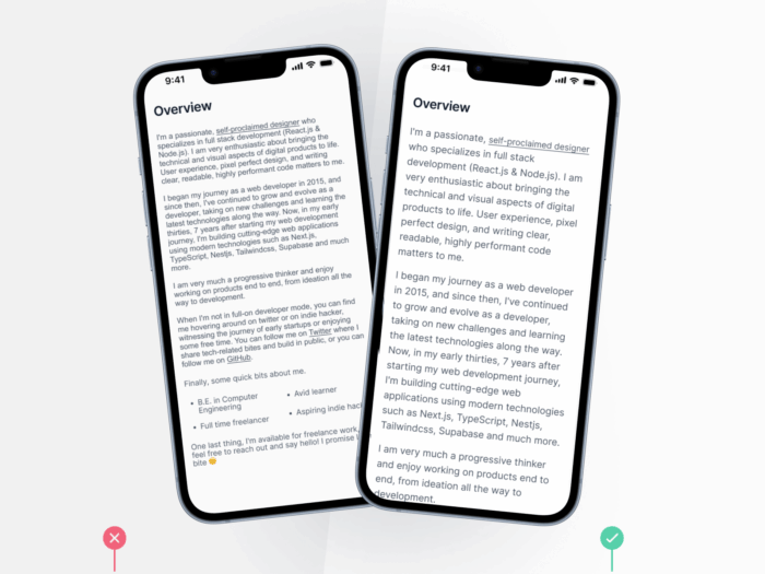
This makes content easier to read for people with low vision, tired eyes, or poor lighting. It also improves reading comfort for everyone, which supports engagement.
2) Headings and structure
- Use clear, logical headings such as H1, H2, and H3 to organise content.
- Keep headings short and meaningful for quick scanning.
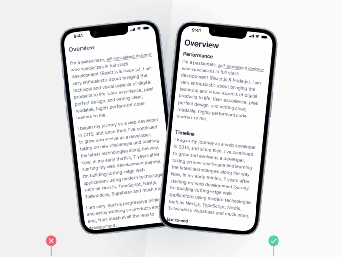
This helps screen reader users navigate and helps everyone find information faster.
3) CTA text and purpose
- Write links that describe the destination, for example, View pricing plans
- Avoid repeating vague link text for different targets
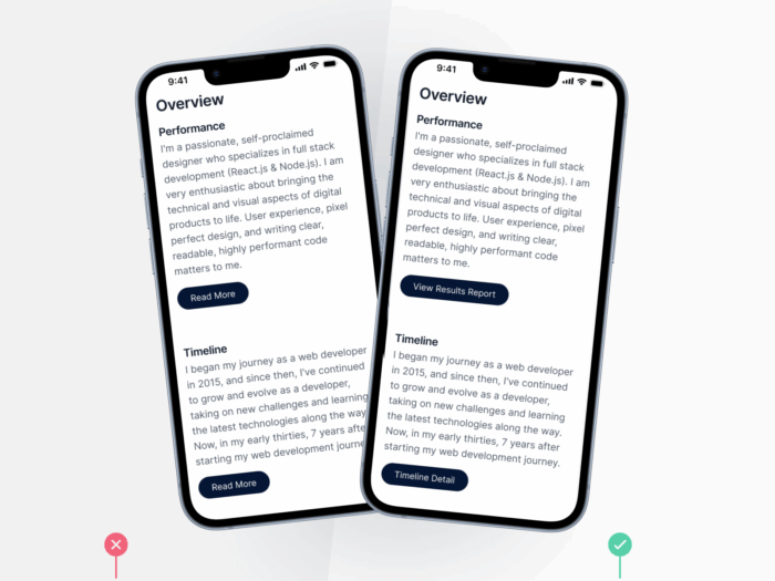
This gives screen reader users clear context and gives all users more confidence to tap, improving navigation flow.
4) Colour contrast and clarity
- Test text and background colours with a trusted contrast checker such as WebAIM Contrast Checker
Aim for a contrast ratio of at least 4.5 to 1 for normal text
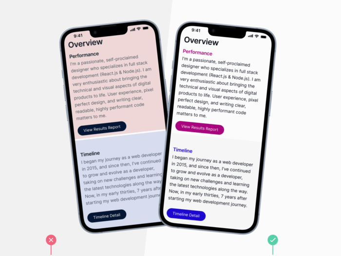
This helps people with low vision or colour blindness and improves legibility for all users, especially on mobile in bright light.
5) Alt text for images
- Add short, clear descriptions to every meaningful image
Describe what the image shows or the job it does
This ensures information in images is available to assistive technologies and also helps search engines understand and surface your content.
What this all comes down to
Compliance is what you have to do to meet legal standards. It keeps your business protected.
Accessibility is what you have to do to meet real user needs. It protects your business outcomes by improving findability, usability and engagement.
Spread the word. Make accessibility and readability part of everyday decisions on your website – not an afterthought.
And if you’d like to use a website accessibility agency to support building that into your digital strategy, get in touch with us today.