With the amount of UX tips and tricks readily available at our fingertips, it’s hard to believe how many websites and other interfaces are still drowning in cognitive noise.
… but here we are.
In a misguided attempt to catch our attention, we still see interfaces that overburden the users’ cognitive load (the amount of mental effort required by the user to absorb new information) by cramming way too much information and irrelevant visuals into any available real estate.
These additional and unnecessary elements are usually referred to as ‘cognitive noise’.
In this post, we’ll delve into the concept of cognitive noise and why it needs to be managed.
Understanding Cognitive Noise:
Cognitive noise in UX design is the static that disrupts the smooth transmission of information from the screen to the user.
Think of navigating a website with excessive cognitive noise as similar to trying to read a book at a dance rave – the distraction would be overwhelming. You probably won’t be able to focus on the plot and will have to keep going back over the same sentence again and again, trying to absorb it.
Realistically, you’re not going to commit to this scenario for very long and are more likely to ditch the book and grab a glow stick.
Now, imagine reading that same book in a quiet library, with soft lighting and minimal disturbances. The experience is immersive, allowing you to focus on the narrative without the strobe light-induced chaos.

“Navigating a website with cognitive noise is like trying to read a book at a rave.”
The point is, that a rave isn’t an appropriate atmosphere for reading a book and the surroundings don’t match the task at hand. The surroundings make it more difficult to focus by adding cognitive noise, like flashing lights, loud music, and people shouting.
The target audience for a rave isn’t people who want to read a book and it isn’t the task that the atmosphere is designed for. Whereas a library should be designed to be conducive to reading, after all, people come to a library to read.
Necessary Noise
There will always be some noise in a library, things that might distract but are part of its functioning like the phone might ring or there might be flyers on the table for an upcoming event.
These things will be considered. The phone will probably be on a low volume and the flyers will likely be in a neat pile. If not, the library could start to look and feel chaotic and noisy, and a lot of its target audience would probably stop visiting.
The same goes for interfaces – there is a level of noise that is unavoidable and acceptable.
But, if it’s just full of useless information and distracting visual elements, users will look elsewhere for a product that has considered their experience and has optimised the signal-to-noise ratio.
Signal-to-noise Ratio
Generally, Signal-to-noise ratio (SNR) is a term used when referring to audio, but it can also be applied to measuring cognitive noise in UX/UI design.
It’s a measure that compares the level of a desired signal (the information the user wants/needs to complete a goal) to the level of background noise (anything unnecessary that distracts the user from completing that goal).
So for example, a website that prioritises visual distractions over intuitive navigation and relevant information has a low SNR. In contrast, a site that prioritises the users’ goal/journey and uses appropriate visuals to enhance that experience, has a higher SNR.
The University of Terrible UX
UAT.edu (University of Advancing Technology) was for a long time held up as a shining example of bad UX design, until its redesign in 2020.
While the approach to the site’s navigation was certainly…innovative…it made for a horrible user experience.

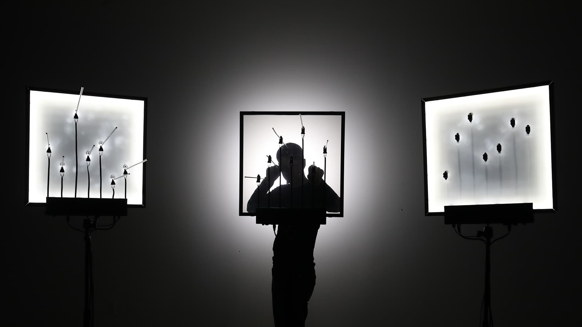
Every aspect of the navigation was animated. To find the content you were looking for, you had 2 options, both of which were literal games of cat and mouse.
You could either:
A: Follow 20-ish images swirling around a man’s head, reading the text overlaid on each and trying to click the right one before it disappears behind him.
Or, B: If you are a very fast reader and incredibly patient, you could wait, ready to immediately click the menu options at the bottom of the page that randomly jump up into view for about 1 second at a time.
The New and Improved University of Terrible UX
With all of that said, in 2020 UAT launched their new, redesigned website.
So, surely the overuse of animation and strange navigation patterns are now a thing of the past right?
Wrong.
The website has come up with a new and improved way of being incredibly distracting and difficult to navigate.
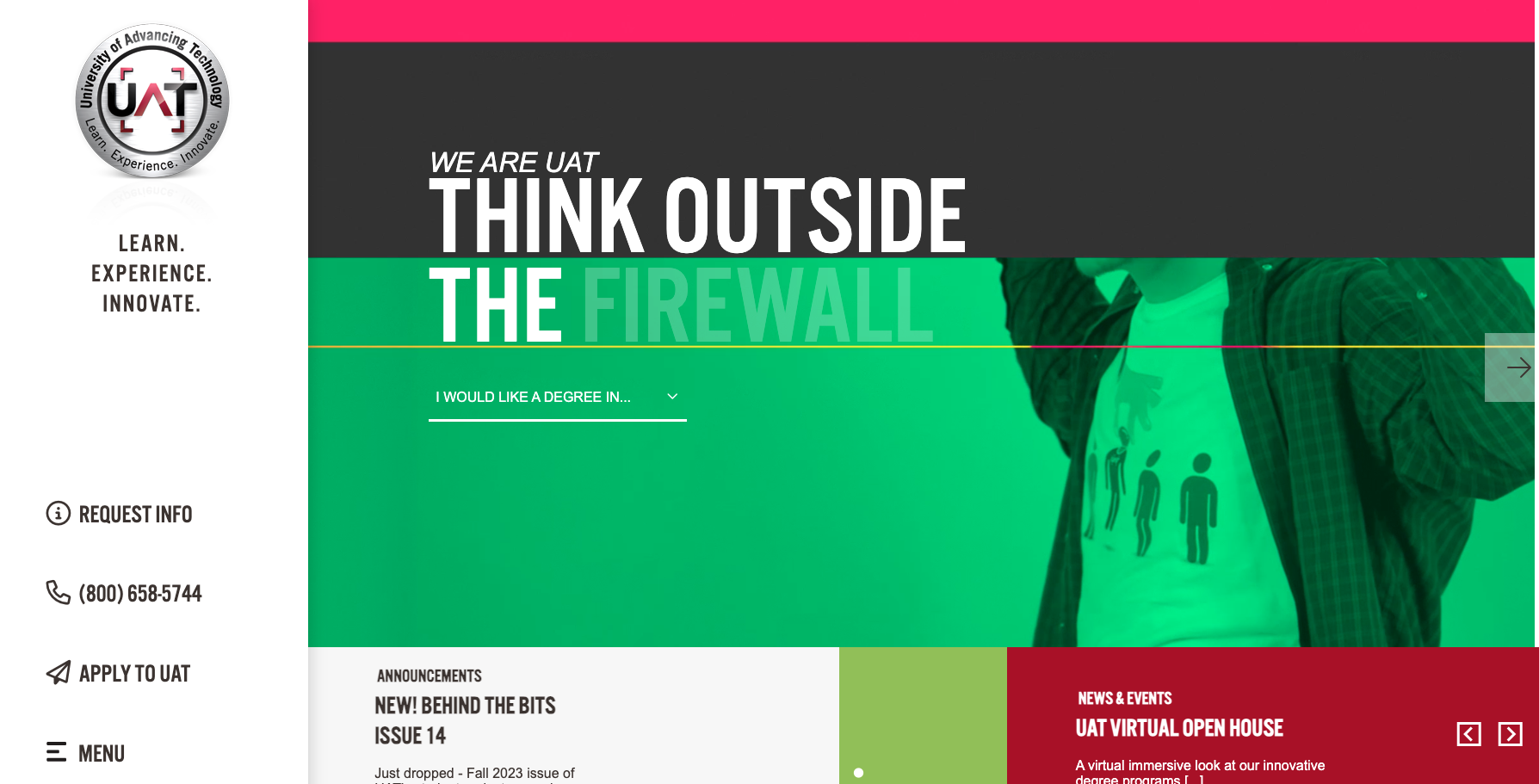
Now there is, at least, a clear call to action to choose what type of degree you want more information about, but it is overlaid on a looping video of students posing and flexing for the camera, with ever-changing colours that slide in and out while you try to read the white text.
Not to mention the annoying animated hover states on cards, the second irrelevant video of said posing students that twirl in and out of view and course a horizontal scroll that makes it easier than ever before to accidentally navigate to whatever webpage you were on previously.
While the new version of the site is, to be fair, easier to navigate than the old one, the design is still overly noisy, disorganised and distracting.
It’s a clear case of a low signal-to-noise ratio, which seems outdated for a university that teaches students to “innovate for the future”.
Minimum clutter, maximum impact
If UAT is the rave from our initial analogy, then the University of the Arts London (UAL) is the library.
The homepage features a clean layout, with a simple, but effective colour palette. The strong, professional imagery of the students’ work gives the site its personality while also setting a professional tone and suggesting high standards of work.
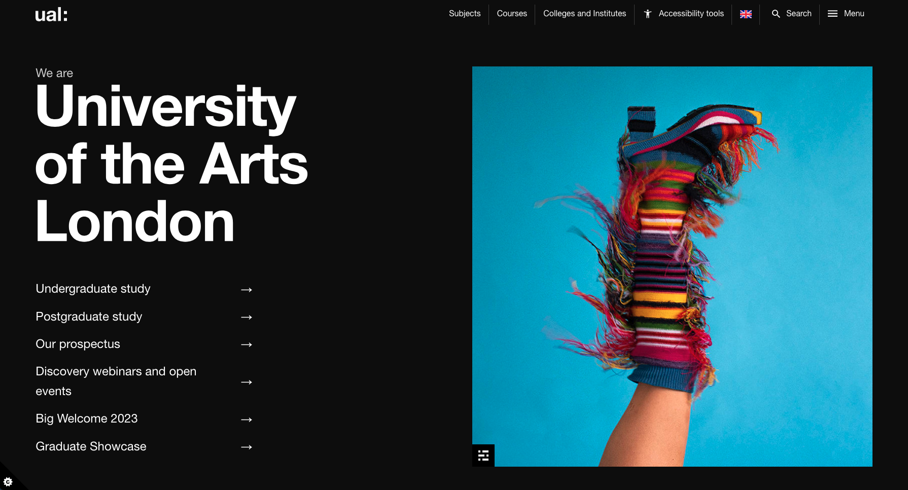
Simple animations are reserved only for hover states, so there are no distracting moving elements vying for our attention, making it much easier to see what is available on the site.
This website has a high signal-to-noise ratio. It is much easier for a user to complete a specific task on this site or to even just browse because the navigation and information are forthcoming and not overshadowed by clutter.
Cleaning Up the Clutter
In conclusion, the battle against cognitive noise is an ongoing challenge in the ever-evolving landscape of UX design.
Enjoyable and effective user experiences are created by embracing simplicity and decluttering digital spaces, rather than cramming as much as possible into a small space.
Design that balances intuitive navigation and minimal cognitive noise, while still portraying brand personality, is key to a successful interface. And if your design doesn’t achieve this, then it’s probably time for a spring cleaning to declutter for your users.
After all, less noise will translate to a better user experience, reduces your bounce rates, and increases conversion.
If you need help identifying the signal from the noise for an improved user experience, get in touch with our team.