
There are a multitude of UX myths out there and the pattern seems to be that many of them have been carried over from the 90’s and 00’s when our technology was very different. We didn’t have smartphones, internet speeds were slow and the number of people using the internet in 2000 was 10% of what is is today. Until Don Norman coined the term “user experience”, it was only adopted by a few of the big tech companies as something called Human–computer interaction (HCI).
Let me dispel some of these myths that cause so much debate, confusion and frankly waste time for clients, UX designers and software developers.
Time to take out the trash!
1. UX is expensive
There is a famous quote that sums up and obliterates this myth.
“If you think good design is expensive, you should look at the cost of bad design.”
— Ralf Speth, CEO of Jaguar
Until recent times interfaces would be designed based on a designer and developers assumptions combined with the stakeholders opinions. Users were not consulted and testing was usually only carried out on the technical side.
Sure, in-depth user research and analysis can take time and effort but it’s almost always worthwhile. Budgets do not need to run high in order to carry out user research. It could be done in the form of a user survey, informal interviews and/or usability testing. A good UX designer will have the tools to match most budgets or project timelines. Skipping research and going straight to design should never be an option, your product will suffer and the time and effort to make it right will be multiples of the initial proposed user research costs. Numerous industry studies have stated that every euro spent on UX brings in between €2 and €100 in return through performance optimisation and savings on design, content and development to fix a bad interface, not to mention the lost revenue due to user friction.
2. Users don’t scroll
Another one from the ’90’s. Lets think about this, when was the last time you landed on a website and didn’t scroll? Scrolling is perfectly natural to us all, there is nothing unusual about it. The thinking that users do not scroll ends up producing websites and apps that have a very cluttered “above the fold” areas that look so busy, users will want to scroll past them, this is what we call a high cognitive load. User don’t deal well with too many choices. With so many screen sizes and devices ‘the fold’ is no longer possible to define.
Chartbeat, a data analytics provider, found that “The portion of the page below the fold is viewed for nearly three times as long as the top of the page.”
3. Users will read all your text
There is a little bit of ego in this one, some will make the assumption that users will enthusiastically read their lengthly mission statement with keen interest. Unfortunately not, most users have very short attention spans, they will land on a web page and quickly scan it for the headings that are relevant to them before they begin to read. If the copy below the heading does not satisfy them within a couple of lines they will stop reading and move on. Well structured and concise page content broken up into bite sized chunks with very clear headings perform best — see how this article is structured? Easy.
4. You don’t need content to start design
Content is the bricks and mortar of an interface. Content will shape the design, functionality and structure of the interface. Design should always be content led, the process of creating content will focus the mind on the goals and objectives of any interface and will cause the project direction to evolve organically. The process of content creation will inspire ideas for other content, it forces the team to really think about how the interface and how users engage with the content.

We are often asked to use dummy or placeholder during design and development as waiting for content to be created can slow the process down. In theory this makes sense if the content structure is not going to change but in the two decades I have been working in interface design I have never been involved in a project where using dummy content resulted in no design or development changes.
Create your content first and the design and development stages of the project will run smoother. The results of this will mean less changes, lower costs, faster turnaround, less stress and a better product.
5. If it works for a competitor, it will work for you
There are a variety of proverbs I can insert here but I’ll leave you think of your own. Just because your very successful competitor is doing something does not mean it will work for you, it may not even be working for them. Sure, lift ideas from your competitors but make sure you test and validate their effectiveness first with your own user base.
6. Icons enhance usability
Don’t get me wrong, icons are a great way of communicating something quickly and universally without users having to read but this only works if the icon is recognisable. If it’s not, we’ll need to add a text label to explain what it is. Now the user has to look at the icon and read the label which defeats the purpose of the icon and slows the user down. As Martin LeBlanc put it “A user interface is like a joke, if you have to explain it, it’s not very good.” The simple rule is, if an icon needs a label, don’t use an icon.
![]()
7. Design has to be original
Most non-conventional interface designs usually carry usability issues. People like familiarity, an interface that is structured in a familiar way will perform better than one that is not. There are a lot of UX conventions that are repeated across websites and apps because they work, users understand them and they provide a good user experience. Don’t try and reinvent the wheel — colour, fonts and photography can usually provide the design originality you want.
8. White space is wasted space
In the same way silence gives us time to think, focus and concentrate — white space in a design does something similar. It gives content room to breathe, to stand out in a way users can focus and comprehend it easily. This brings us back to cognitive load, if we throw too much at a user they will become confused and frustrated. White space is your friend, don’t be afraid to use it liberally. Look at the simplicity of this webpage, few distractions and lots of white space (especially on desktop where we can afford the space).
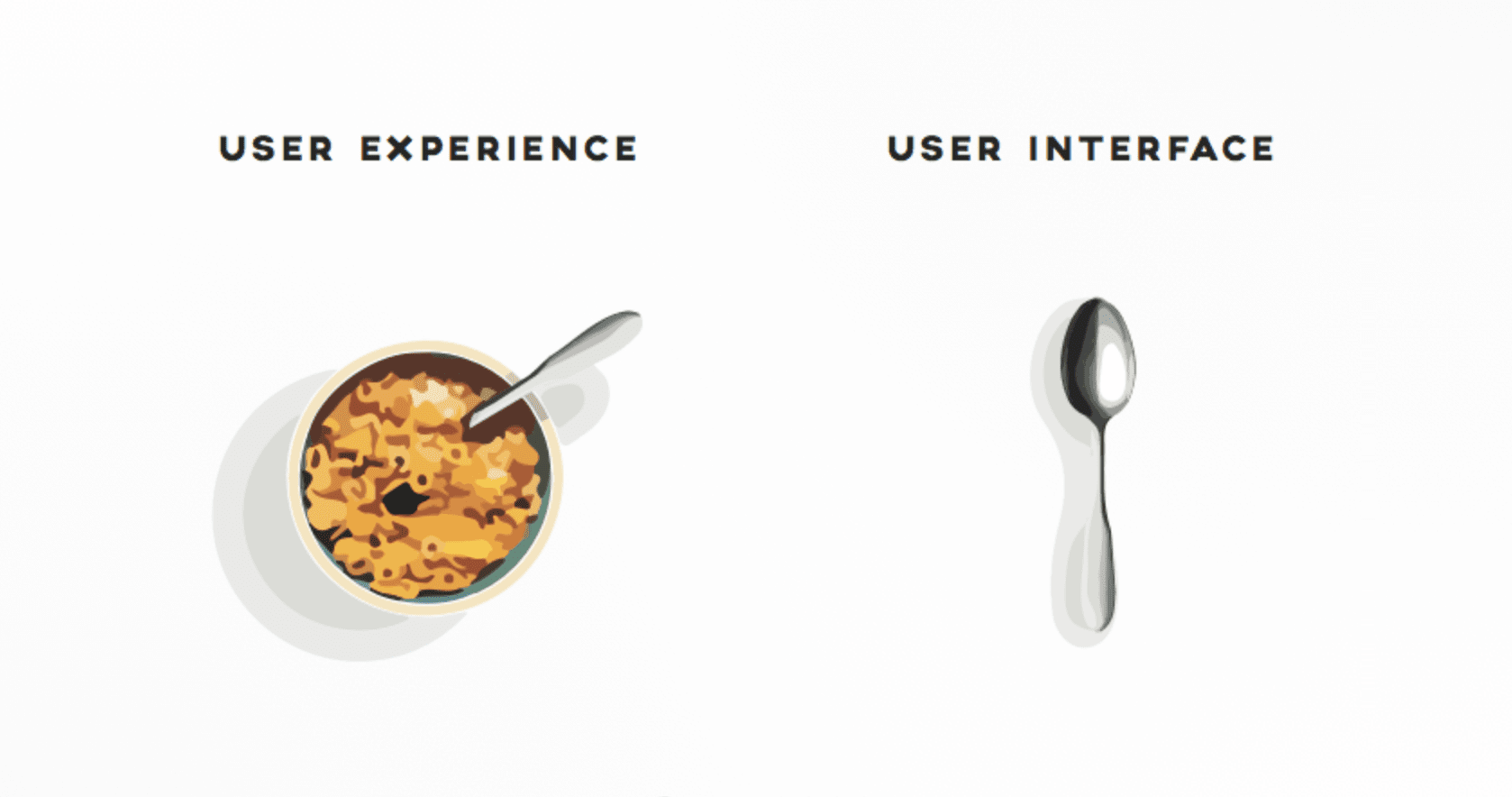
9. UX design is the same as User Interface design
I wrote a piece about this a while back as there is a lot of confusion around this both inside and outside the industry. First, let’s just define each.
UX or user experience design is grounded in research with the goal of understanding user behaviour in order to design an interface that will address the users goals, motivations and pain points. UX is the design of the how it feels to use something, the flow, the functionality, the wording all working together to create a smooth and clear experience.
UI design is design of the interfaces aesthetics – the colours, fonts, imagery and layouts. It sets the visual tone, style, look and feel.
While some UX designers may also do some UI design and visa versa, this is not always the case and less so as time goes on, they are both very different areas of expertise but collaborate very closely, one cannot work without the other.
“UI is the saddle, the stirrups, & the reins. UX is the feeling you get being able to ride the horse.”
— Dain Miller, Web Developer
10. Usability Testing is not always necessary
If just one user research method is going to employed in a project it should be usability testing. It will probably reveal why you should have done more pre-design user research.
Observational is the most powerful user research method we have, watching users interact with your interface usually brings up all kinds of surprises and exposes any assumptions. It doesn’t have to always be carried out under lab conditions, it can be done casually over a cup of coffee with a few friends or colleagues that have not been exposed to the project. I wrote another piece about this a couple of years ago.
There are many other UX myths and more will be revealed as technology and UX practice evolves, I’ll come back and update this in a couple of year and see where are at with ‘the fold’!


