While shopping online recently I found myself on the Kilkenny Shop website. I decided to make a list of 8 UX design improvements that I think could help enhance their customer experience.
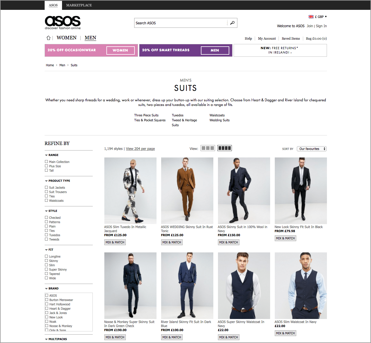
So this isn’t a website roast. Granted, the Kilkenny Shop hasn’t got the experience you’ll find at some of the biggest eTailers such as ASOS.com or Amazon, but it does have a solid content structure and it’s easy to navigate.
1. Increase Column Width
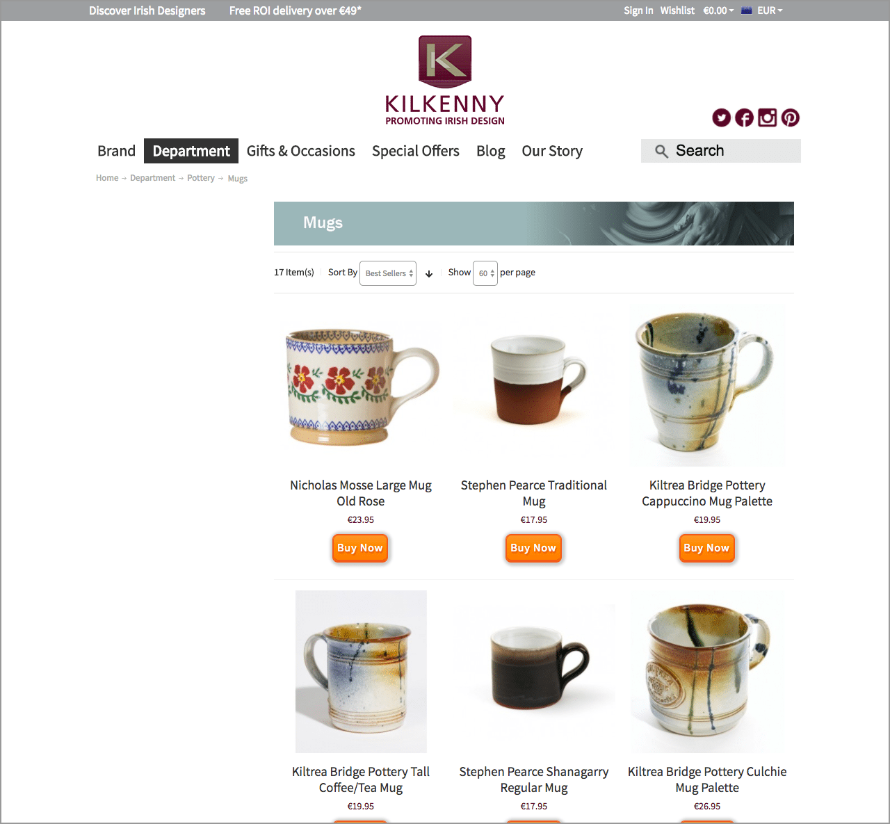
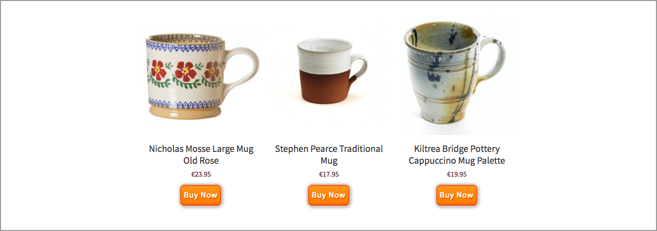
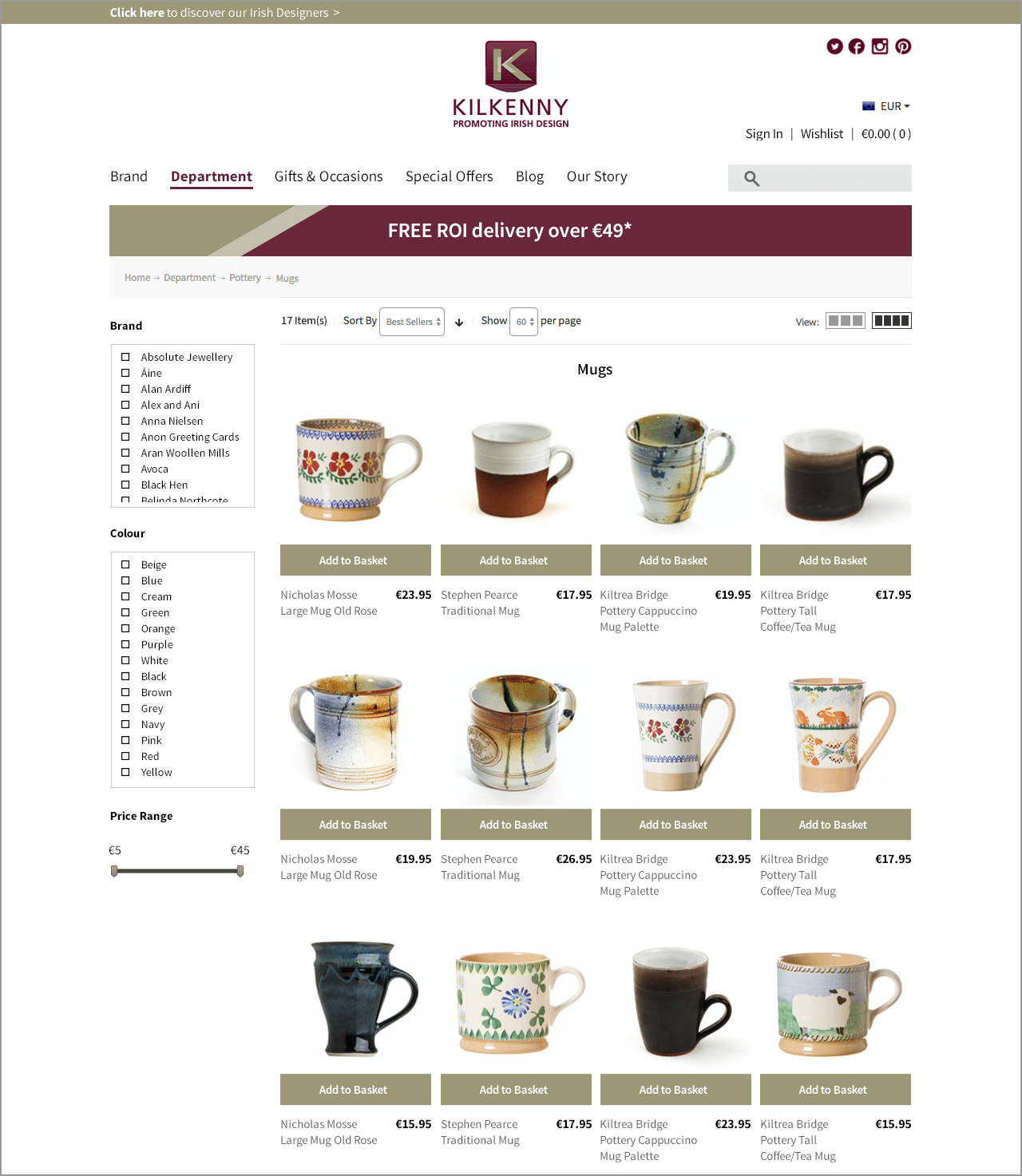
Show me more! First off, the 3 column grid is narrow and accommodates some lovely sized products shots, but it’s restricting the number of products I can see, especially on smaller screen sizes.
Since there is no side bar filter, the content could be expanded to 4 columns, while adding the ability to switch the grid size between more or less products on show in the results bar, ASOS have implemented this perfectly.
2. Filter by Brand
Since each department contains multiple brands with up to 100 product results, it’s not enough to just have a ‘sort by name’ filter. The user needs the ability to filter by brand. This addition would greatly improve the speed it takes users to narrow down their search and buy.
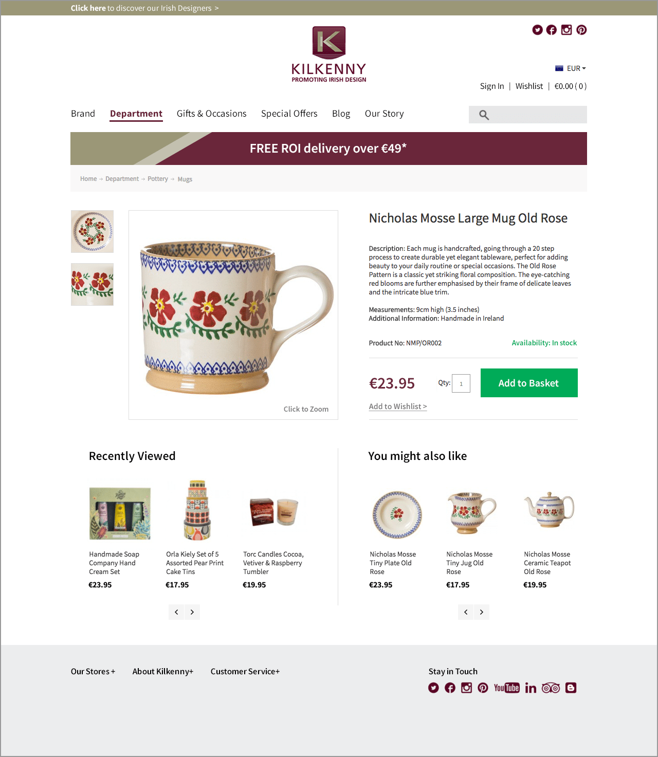
3. Clearer Information
Important information that should be clear and stand out on this results page are the product name, price, and the ‘buy now’ button. Although the button is prominent, it’s completely overpowering the more important element – the price.
The price is actually the smallest detail and is almost completely lost – it should be much clearer for the user. An easy fix.
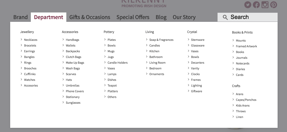
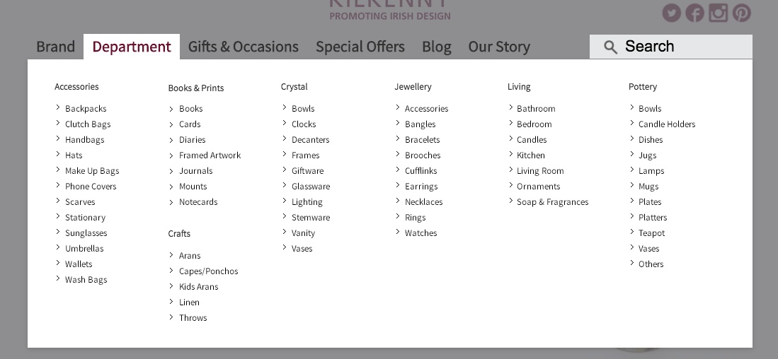
4. Categorise by Alphabetical Order
Pet hate of mine this one – when the product navigation isn’t categorised alphabetically.
When you have a large inventory of product types this is even more important. The faster people can find what they want, the quicker you can move them through to the checkout process.
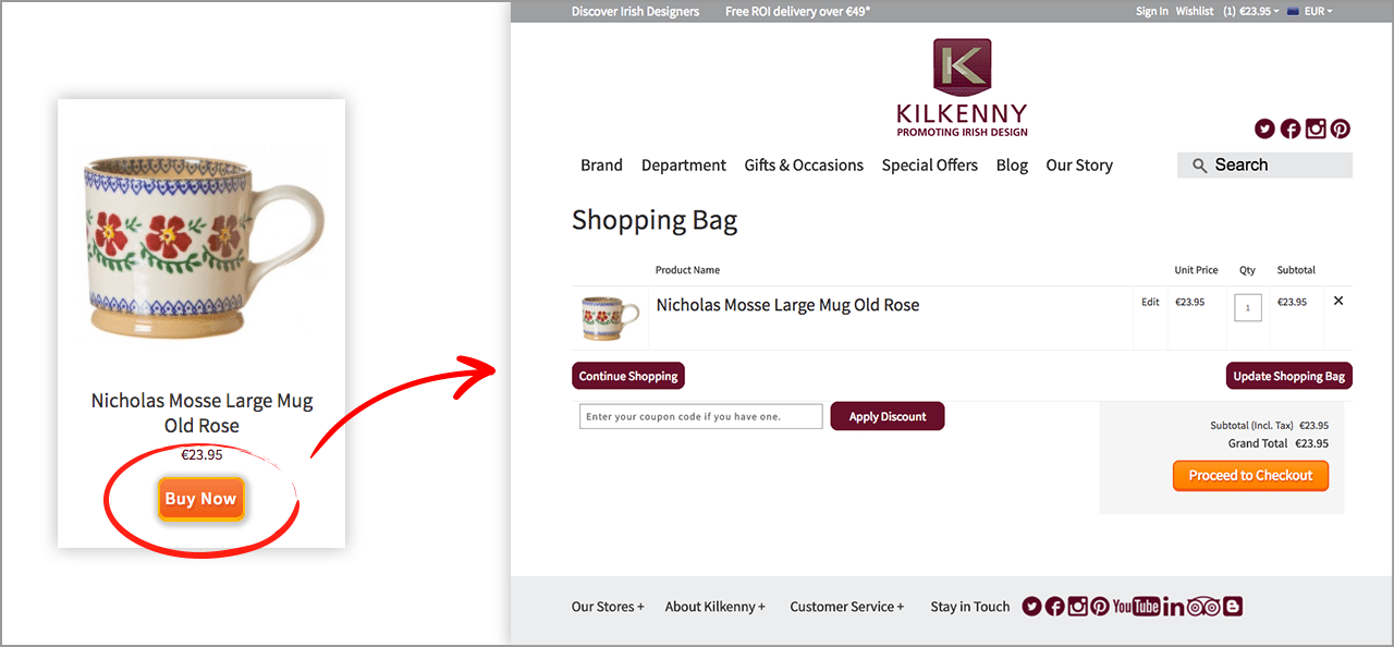
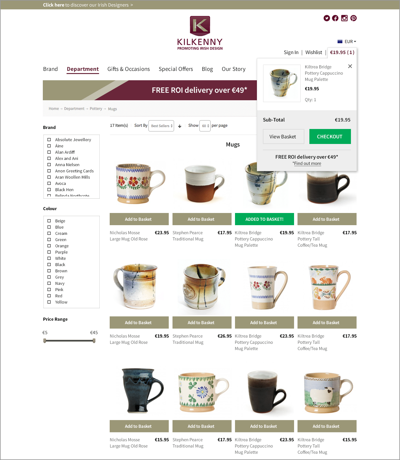
5. ‘Buy Now’ Button Redirect
This is very annoying! Yes I added the product to my cart, but I want to keep shopping! Stop dragging me to the checkout, I’ll pay when I’m ready.
This button should be called ‘Add to Basket’, leaving the user satisfied that it’s in the basket and free to continue shopping.
It’s a frustrating process as a user, having to keep clicking ‘continue shopping’ after being rushed to the checkout page, and as the seller you risk missing an opportunity to sell more.
Let the user shop till their hearts content and they’ll decide when its time to checkout.
6. Better Content Visibility
Hidden away in the thin header bar is the cart and promotion message, granted its where you would expect to find it on the page, but it needs to be bigger and clearer.
Users will become impatient if they have to stop and think to find links as this slows buyers down.
Firstly, the users basket is squashed between the Sign in, Wishlist and Currency buttons, it doesn’t stand out at all and the white text against the grey bar can be difficult to read, especially for visually impaired users.
The basket could be swapped with the social media icons as they have been give slightly more prominence they need.
Additionally, a nice feature that could also be added is a colour change or a dropdown widget to the basket text, making it absolutely clear when the basket area has updated when the user clicks ‘buy now’, let them know they’ve “Successfully added” a product.
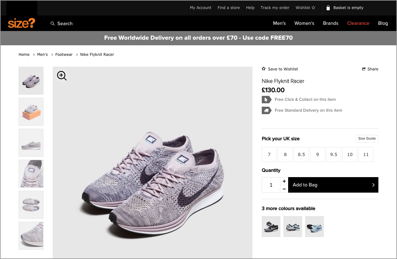
Secondly, why is the Free Delivery promotion so small? This could be largely improved by adding colour or even pulling it out in a slightly larger bar that sits below the navigation, you are trying to encourage the user to spend more money, shout it! See how Size do this below.
7. Better Page Structure
The product page is a just mass of unstructured content and is suffering from information overload.
The page has a good balance of product information and caters for the quick shopper and also the shopper who needs every last product detail with other options, it just needs a better structure.
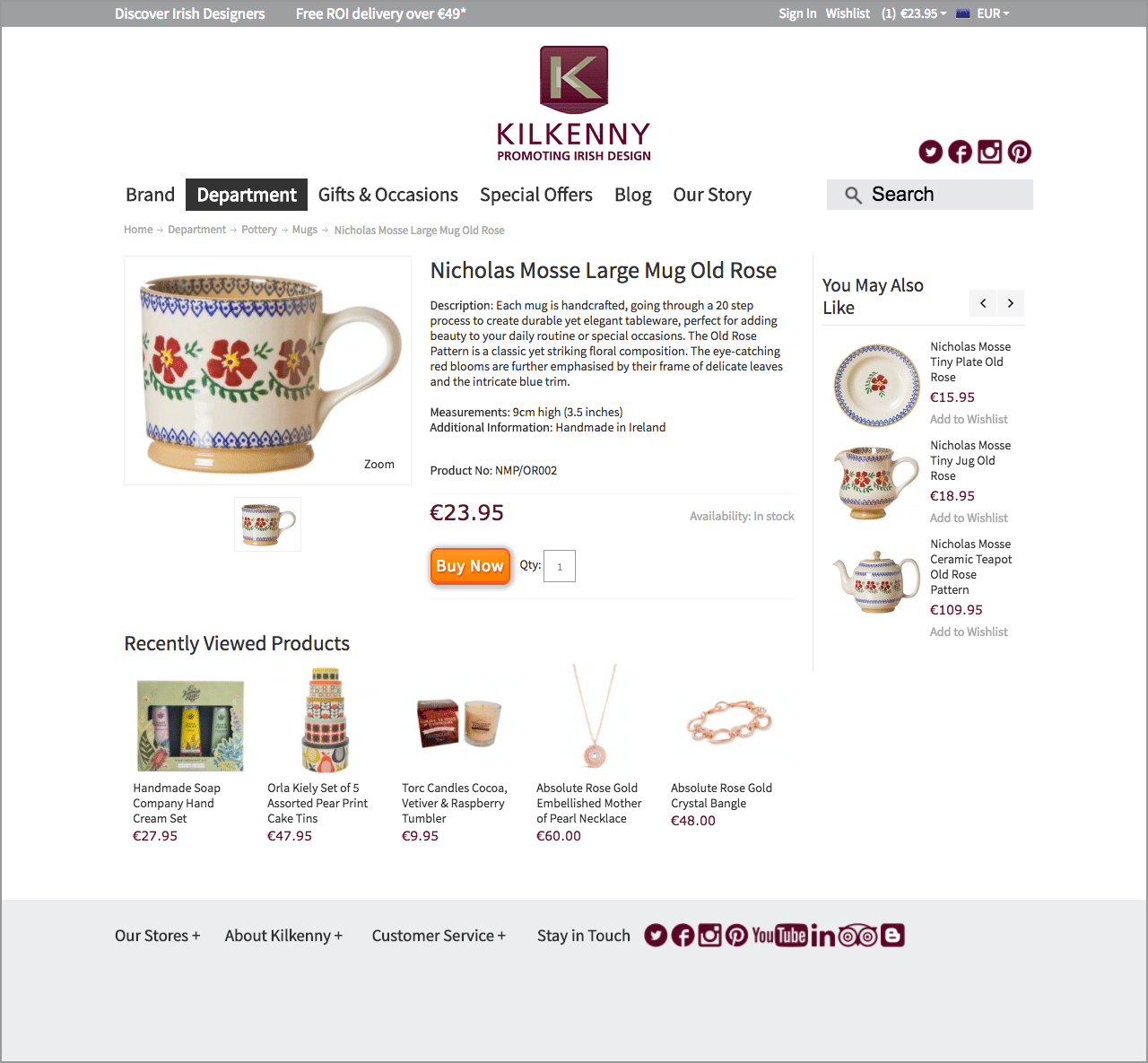
The first thing you notice is that there is no space between the top navigation bar and the product area. This would be a perfect place to pull out the ‘Free Delivery’ promotion, creating a clear break area in the content whilst giving the user that added incentive to add more to their basket.
Make the photo bigger. Users love large photos with the ability to zoom in, it’s the closest they can get without physically holding the product. Bigger, better product images can increase conversions.
The ‘You may also like’ section has also been given too much prominence on this page and can be relegated below the product information or the fold, it automatically rotates through products and is just a distraction.
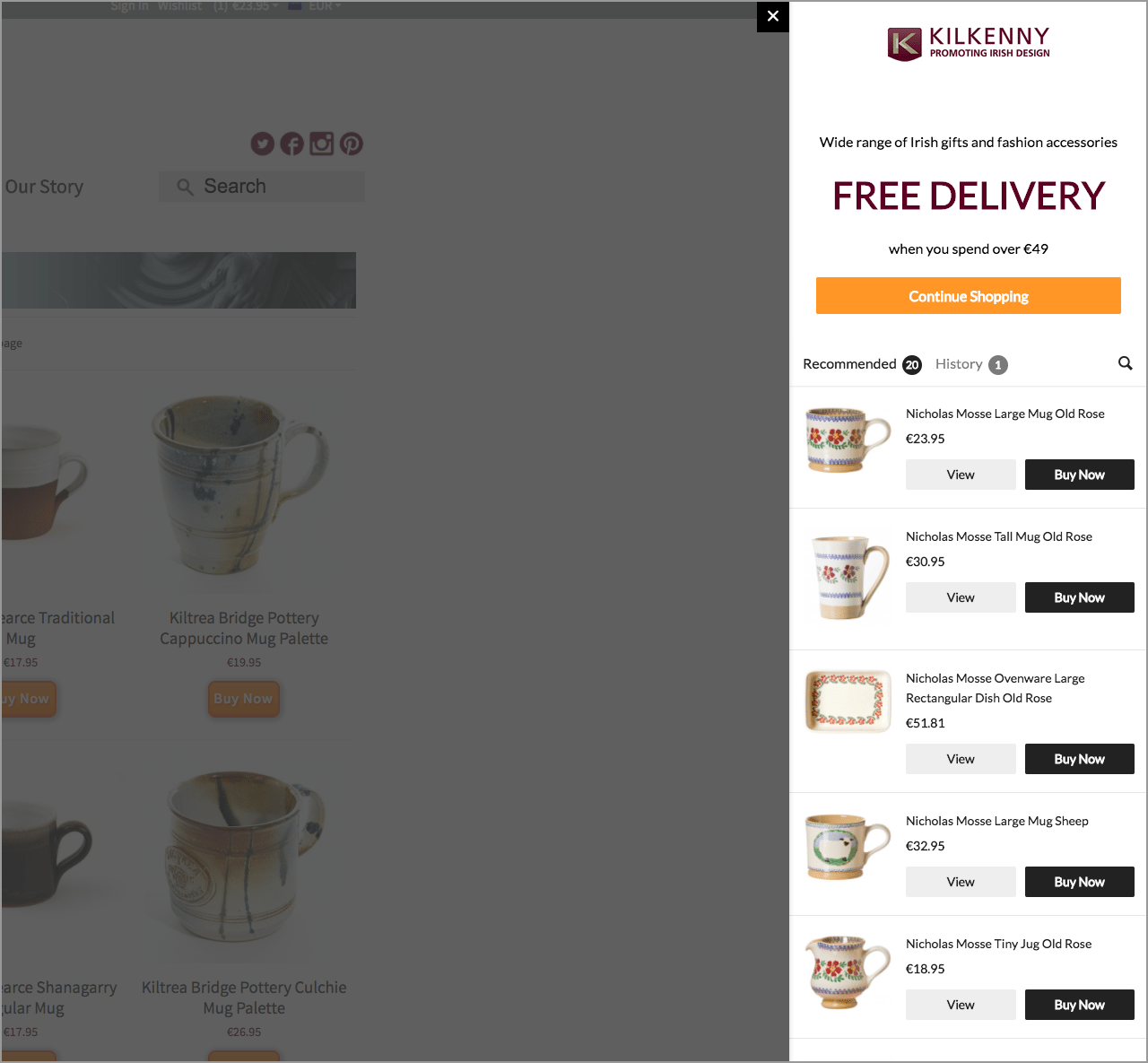
8. Pop-ups
Pop-ups on websites can be particularly annoying.
This pop out window appears when you are inactive on the site for a while. The content isn’t relative to anything I’ve recently clicked on or based on anything I’ve searched on the site, so its irrelevant to me and there is no ‘don’t show this again’ button.
The Solution
So, lets see what all this looks like when put into practice. I’ve quickly mocked up some new layouts below.
This one shows the department landing page reworked using the existing content with the additional filters.
The next design shows an improved purchase process, the product being added to the basket is clear, and the user remains on the shop page offering a more seamless shopping experience.
The final visual shows the revised product page, the layout has been re-structured to improve the reading order and moving secondary content below the page fold.