
Dear Design Community,
By now we’re all pretty sick of the Liquid Glass discussion, but bear with me, I’ll try to keep this short. I’m not jumping on the bandwagon of anger, just trying to bring some balance to the force.
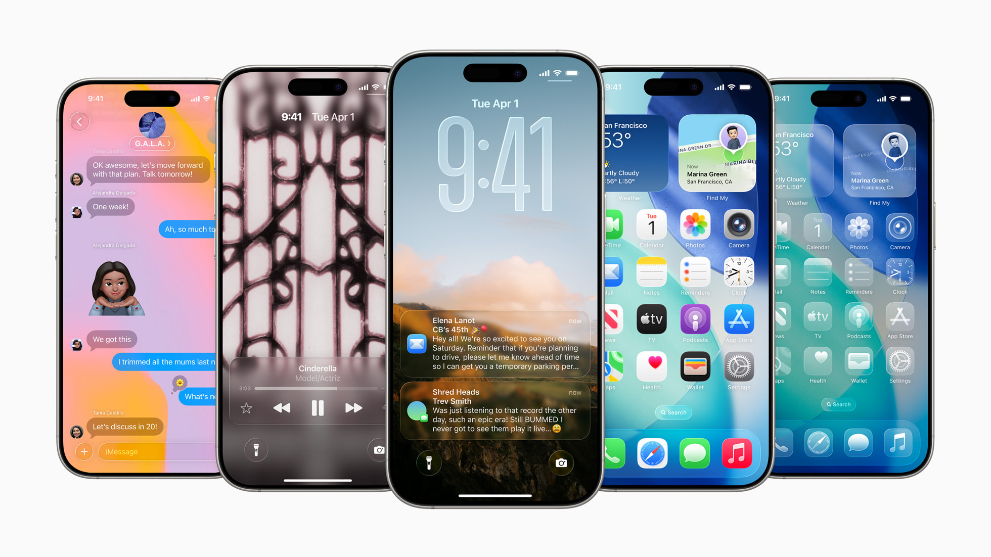
Last week, Apple gave us a sneak peek of its new UI design language: Liquid Glass (or ‘Liquid Ass’, depending on your preference). It’s their first design system to be used across their full suite of products – from Mac to iPhone, Apple Watch to Apple TV. Apple says Liquid Glass “…delivers a unified design language across all platforms, seamlessly blending hardware and software. It introduces a more fluid and dynamic interaction experience than ever before, bringing a striking new look to every part of the interface.”
This seems to align with Apple’s broader push into spatial computing via the faltering Vision Pro, where depth and layering are central to the design narrative.
In Liquid Glass, the native UI layer responds dynamically to what’s beneath it on screen. Aesthetics aside, it’s technically impressive. But design-wise? I’m not fully convinced. It feels over-designed. I’ve always liked the simplicity of the flat design language we’ve lived with for the past decade, but change happens and I’ll keep an open mind until I’ve used it myself.
This is an outrage
What genuinely surprised me was the absolute outrage from the design community. Designers properly lost their shit! The main complaint was that Apple had ignored accessibility standards.
I’m talking proper hysteria. As if there’s nothing else happening in the world to get upset about.
When Apple makes a design statement, people listen, they lead the industry. Skeuomorphism, flat design… we’ve all followed the trends they’ve set. And let’s not forget: Apple has a strong track record in accessibility. Features like VoiceOver, Display Accommodations and AssistiveTouch are baked in system-wide, not bolted on as afterthoughts.
I understand why some designers feel betrayed. We’ve seen giants like Meta and Google quietly backpedal on “woke” values and ESG commitments – all to kiss the ring of King Trump. But let’s not assume Apple’s just joined that party… yet.
Strategic – Not Stupid
There are some thoughtful takes out there worth listening to – if we can get past the outrage.
It’s far more likely that Apple knows exactly what it’s doing. These so-called “accessibility issues” may not be mistakes at all – they might be deliberate. Think about previous Apple moves: removing the headphone jack, killing off the home button… they love creating friction to force future adoption.
Liquid Glass could be a strategic move to train users for what’s next, like smart glasses. A step towards a fully immersive Apple ecosystem, where the optimal UX might require new hardware. Maybe this isn’t a blunder – maybe it’s onboarding and needs a few tweaks.
Yes, That Screenshot – But Also… Perspective
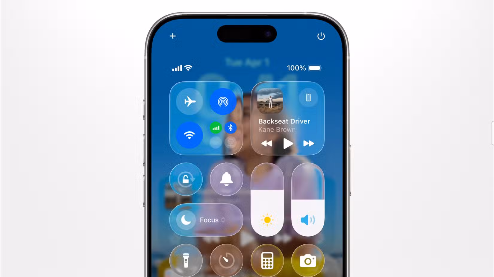
Sure, that Control Centre screenshot (below) doing the rounds doesn’t look great in terms of accessibility. But here are a few key points people seem to be forgetting:
1. It’s a Beta
The final release is three or four months away. This is developer and public beta territory – and nothing at this stage ever ships exactly as shown.
2. We Have Choice
Already in the beta of iOS 26 are options – contrast, transparency, text size, motion effects. You’re not being forced into this. And hey, you can always choose not to upgrade.
3. One Screenshot ≠ The Whole Picture
Yes, that control panel looks rough, as do so e other examples. But other examples floating around actually seem ok. Let’s not base a full-blown meltdown on one bad UI state in a beta.
Final Thought
Accessibility is important, no argument there. But let’s breathe, give it time, and maybe save the full-scale freak-out for something more catastrophic than shiny buttons and blurry panels in a beta interface.


