The Three-Click-Rule is an unofficial usability heuristic that feeds into the notion that we should be counting clicks to measure usability. It states that if users don’t find the information they are looking for within three clicks, they will get frustrated and leave the website.
However, in recent years, the notion that usability can be accurately measured by the number of clicks needed has been widely debunked.
Yet, this myth still manages to pop up from time to time and presents a challenge for UX designers when advocating for intuitive navigation.
So, we are going explore the origins of the 3-click myth and shed light on why reducing clicks doesn’t automatically lead to a better user experience.
The origin of the 3-click-rule
The origin of this ‘rule’ is fairly ambiguous, but the first apparent definition appears in Jeffrey Zeldmans’ book ‘Taking Your Talent to the Web’ (2001)
Zeldmans reasoning for this rule comes down to the users’ very real need for instant gratification. But, there’s no evidence to show that this rule even addresses that need. Zeldman himself says that it’s more of a suggestion than an ironclad rule. So, why he put the word ‘rule’ in the title is questionable.
Applying the 3-click-rule
If we look at websites from 2001, when this ‘rule’ was in effect, we are confronted with sprawling navigation bars and pages full of text links. Somebody is clearly trying to get us from A to B in under 3 clicks (at the expense of aesthetics).
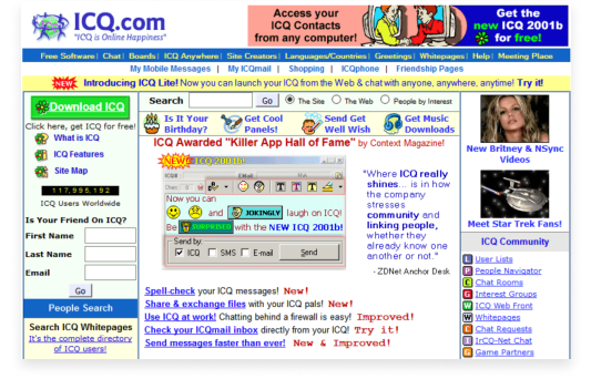
2001 homepage for ICQ.com
But what happens when you have to fish through a load of options to find what you’re looking for?
It slows you down, you are overwhelmed with choices and you waste time searching for the right option. It’s known as the paradox of choice and it’s the perfect recipe for user frustration.
The Paradox of Choice in Action
The paradox here is that while users are most attracted to the idea of having lots of choices, it’s actually easier to make a choice when faced with fewer options.
A study titled “When choice is demotivating: Can one desire too much of a good thing?” (Iyengar, S. S., & Lepper, M. R., 2000) demonstrates this nicely.
In this study, researchers set up a tasting display of 24 different jars of jam in a supermarket. All of that selection appealed to a large number of shoppers, with 60% stopping to taste the options. They then reduced the display to 6 options the following day and attracted fewer people.
But there’s a plot twist.
Guess which display resulted in more sales than the other? Well, it turns out that people are 10 times more likely to make a purchase when presented with fewer options.
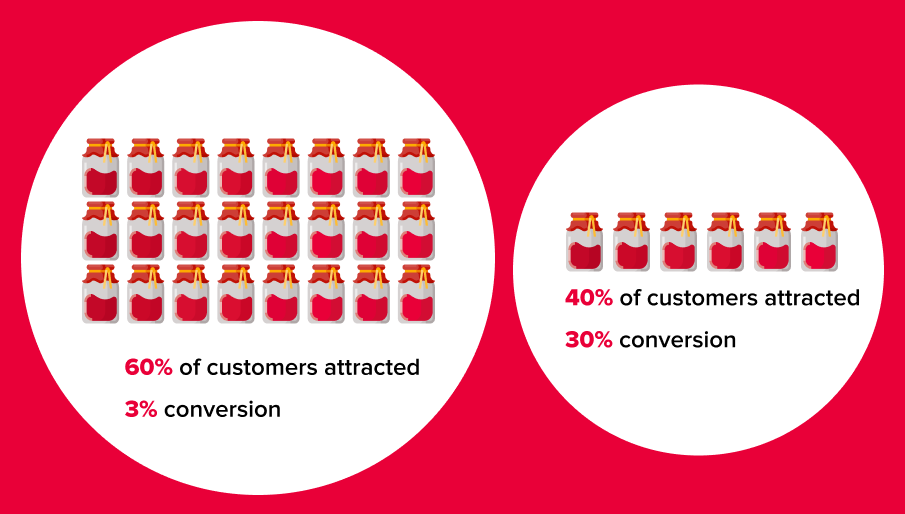
The jam experiment results
The paradox of choice vs. The 3-click-rule
So how does all of this relate to the usability of a website, app or any digital screen?
Well, the 3-click rule suggests displaying all (or most) options upfront. But, now we know that this will overwhelm our users and lead to fewer conversions. So, it would be better to throw that rule in the bin and display only a few options at a time, allowing for a few more clicks.
It’s important to note, these extra clicks should be meaningful, they should lead the user down the path to their desired content. Also, we aren’t going to get rid of the rest of the options, we are going to categorise the options into 6(ish) logical groups.
Why 6? Because people only have the capacity to remember 7 pieces of new information at a time. So, we aim for 6 to make it as easy as possible, and it allows for an addition that may come at a later date.
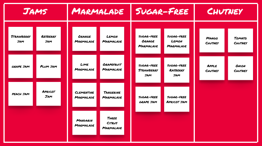
So in terms of our jam metaphor – we might first let the user choose which fruit they want their jam to be made from, and then show them only the jams made from that fruit. This way the user can quickly narrow down their options to ones that are relevant to them and their goal.
But there are many categorisation options and their suitability for the job depends on the site, its purpose and its target audience. So, how do we choose the right categories?
Simple answer, we ask the user.
User research for an intuitive navigation
Arguably the best way (but not the only way) to find out user expectations of content categorisation is through a card-sorting exercise. We can even use this to find out what they would expect the names of the categories to be.
We can then develop an information architecture based on these categories. After that, we can conduct tree testing to validate the new navigation and find areas that need improvement.
By including our users in the design process, we ensure that our navigation is intuitive and user-centric.
Example of a card sort
Categorisation for larger websites
Categorisation for a larger website, with more content and pages, can be a bit more complex. In these cases, categorisation will likely require more levels. To explain this a bit better, I’m going to go back to our jam metaphor one more time.
On a jam company’s website, the primary user goal is to buy jam from an already limited number of options. So, naturally, the user should achieve their goal with a small number of clicks.
Finding the same jam on a supermarket website that stocks it among hundreds of other products is a different story.
On the supermarket site, jam is just a small piece of the information architecture puzzle. Here, we have to look at more layers in terms of parent, child and grandchild categories, as well as filters.
So the user flow to a particular strawberry jam might look like this:
Homepage > Pantry > Preserves and Spreads > Jams > Desired jam.
Meaningful clicks
The user now has at least 4 clicks to achieve their goal on the supermarket site, but each click is meaningful. They are on an intentional journey, narrowing their options and getting closer to the content they want, in the least overwhelming way possible.
If we applied the 3-click-rule here, we would get the user to a page displaying every brand and type of jam that the store has to offer, putting them in the exact situation we are trying to avoid, where only 3% of our website visitors will actually buy jam.
Now that might not seem like a big deal in terms of jam because people will probably buy the rest of their groceries and a sale will still be made.
But what about on a hotel booking website, where the user is there to make one single big purchase?
If we make users fish through every hotel in the world, in the interest of saving clicks, we are going to lose them to a more intuitive website.
And that is exactly why we should not be counting clicks as a measure of the usability of a website, app or any digital screen.
What to keep in mind
If you take anything away from reading this, let it be this:
- The 3-click rule is a myth.
- Users prefer to make a few extra clicks than to decode tonnes of information.
- Stop counting clicks and start making each click count.
Also, if you like jam (or award-winning work), check out the experience we created for Follain at: www.follain.ie.
If you’re interested in improving your websites user experience through intuitive navigation, get in touch with Friday