
A website’s cookie notice is something that is often overlooked during the design process and tends to be a last minute quick design addition.
This can lead to them being too disruptive, poorly functioning, not in line with your website’s look and feel, or just plain ugly. But they don’t need to be.
By law, all websites owned in the EU or targeted towards EU citizens are expected to display a cookie notice, failing to comply risks enforcement action from regulators or even a fine.
The Cookie Law is a piece of privacy legislation that requires websites to get consent from visitors to store or retrieve any information on a computer, smartphone or tablet.
It was designed to protect online privacy, by making consumers aware of how information about them is collected and used online, and give them a choice to allow it or not.
GDPR brought this to the forefront in very unnecessary ways, with many websites clamoring to ensure that their users know that they ‘use cookies’.
Much of the point of GDPR may have been missed here, and it threw up some horrendously intrusive (and unnecessary) cookie notices. We’d go so far as to say that some of them have even ruined the website’s experience.
Here’s a look at some different approaches for implementing a Cookie Notice into your website.
Header Notice
Klarna uses a prominent solid colour bar anchored to the top of the page with a simple but clear message and a bold button.

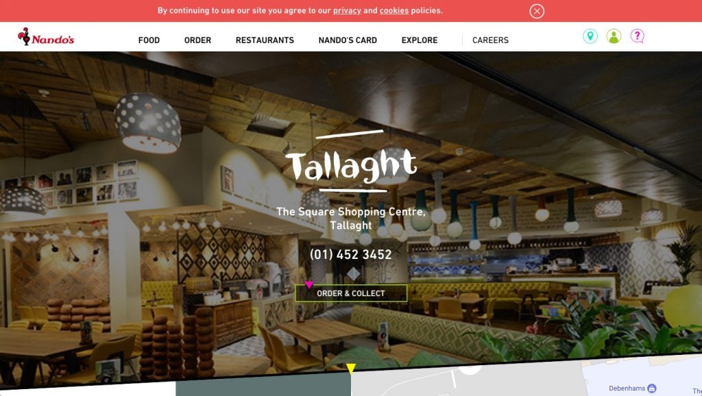
Nando’s also kept the message and button minimal, the cookie notice is incorporated into the page by using red to match the logo making it feel less intrusive.
Filippobello delivers a text-heavy message set in an imposing black bar that commands the user’s attention immediately when they land on the site.

Footer Notice
Adidas have used a transparent footer bar and lots of text. The ‘close’ button stands out against the small font size of the text, most users will simply close the notice without reading the copy.

Selfridges has a bold and bright notice splashed across the footer of its home page, with a light-hearted cookies reference to their food hall.

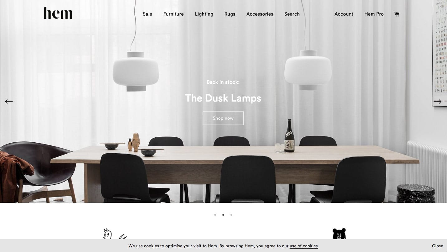
Hem have opted for a minimal footer notice that blends in with the colour scheme of the site, the copy is short and simple.
Floating Box Notice
Puma, the user is greeted with a pop-up notice box that requires immediate action, the user can either agree or just close the panel.

QCTerme uses a subtle hover box that doesn’t have a close button but allows the user to either accept or view the cookie policy.
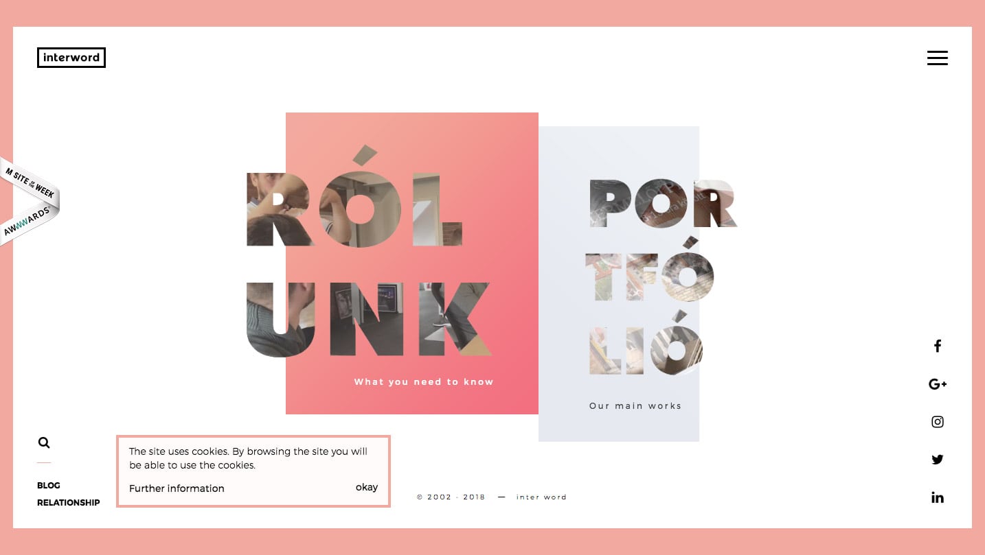
 Interword uses a similar approach to QCTerme but has incorporated the style of the box into the page design.
Subtle Notice
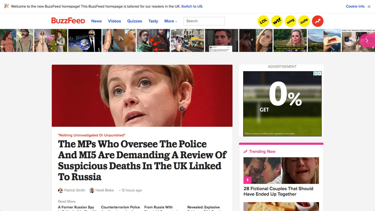
Buzzfeed’s cookie notice commands no attention and is easy to miss set against the white background of the site. Its been given no importance on the page, it’s simply added as a box-ticking exercise to meet EU Cookie Laws.
Linkedin’s cookie policy is very easy to miss, its incorporated into the sign-up window above the ‘Join now’ button. When the user clicks join now they also agree to the cookie policy.

Apple’s implementation is very subtle, a simple hyperlink in the footer.
In-page Notice
Barclaycard has interestingly incorporated the cookie notice into the hero image below the navigation. The notice is in a prominent location but is blended into the hero image using a matching colour bar.

Guinness uses a similar tactic to LinkedIn, they get the user to consent to cookies at the same time as logging in, on the Guinness website it’s when the user enters their ID.

Zurich has done similar to Barclaycard by placing the notice below the navigation but kept the message simple and placed it within a bold blue horizontal bar.

Summary… are cookie notices a necessary evil?
Necessary? Yes. Evil? No, they don’t need to be.
With the right considerations, they can become a natural part of the website’s design and they don’t need to distract from the overall experience.


