
 Dave Jackson
Over the years we have approached UX design using a variety of different processes and techniques in order to perfect our service. That’s the beauty of working in a relatively new and fast-moving industry, to a certain extent you need to learn through trial and error, you learn from how other people work and take away what you think will work for you, your clients and their users. We are never finished learning and developing our process, we are always improving how we work.
Not to be confused with content first design
Before I launch into an article about content led responsive website design I want to be clear that this is not about content first design. Content first is a methodology that sits alongside form follows function. The structure and layout of a website or app will be determined by the content it is going to display. Designing software without content is a flawed process, if the content comes first then the layout and UX will flow from this. All clear? Great, let’s get to the topic in question.
Mistakes of the past (and present)
It was about 6 or 7 years ago when responsive web design became the standard. For us, the process of creating a great user experience across the variety of devices and screens sizes has improved dramatically. New technology has helped along the way with better usability testing, responsive grids, frameworks and a more fine-tuned process. Designers are getting better at this by working more closely with developers but there are 2 issues I am seeing come up again and again. The first is that there are UX designers still not designing for mobile first, I continue to be stunned by this fact and you can read my rant about this here. The only time you should start designing desktop first is when the majority of your users are using desktop PC’s and in most cases, this is a very small amount of websites.
The other key mistake I see UX designers making is designing websites using the same 3 fixed size templates for mobile, tablet and desktop. Mobile sizes have changed since the days of the 4″ phones, there are phones the size of small tablets and tablets the size of big phones, tablets range from 7.9″ all the way up to 12″, this is around where laptops and desktop screen begin and they can go beyond 80″. So in terms of pixels, you can be sure your website will be viewed on screens with any width from about 320 pixels all the way up to desktop monitors with 5,000 pixels running across the screen. Designing for 3 fixed sizes of mobile, tablet and desktop simply isn’t good enough anymore.
What screen sizes do we design for?
The answer is that you shouldn’t design for any screen size. The layout should be fluid and the content should decide the layout of the screen. When the content needs space, give it space. When the content won’t fit, change the layout. When the content is breaking, add a breakpoint. Start by designing for the smallest mobile (320 px) and see how the content adapts by quickly testing your designs with a wider and wider canvas until it reaches a point where it needs a new layout to adapt to the increase in screen space. Pick 3–4 break points from the smallest up to your max screen size. Using this technique your website will look good on all devices now and into the future. Use the screens real estate but also use the white space to highlight the content and calls to action.
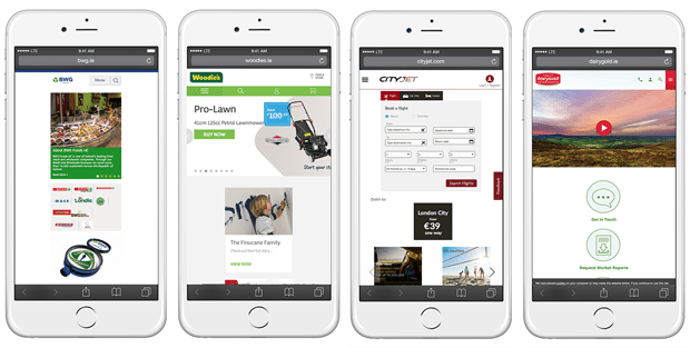
The website examples above are displayed on a large 5.5″ iPhone 7 Plus. The phones here are displaying website content that was designed for a much smaller 4″ phone that was more popular maybe 3 or 4 years ago. You can see the content sits in a narrow single column where in some cases there is only about 50% of the screens real estate being utilised. If they let the content decide the layout you would have a much richer and more engaging user experience with less scrolling.
Bootstrap and other frameworks
Some developers have become reliant on frameworks with older pre-defined breakpoints like Bootstrap and Foundation. Unfortunately, these frameworks can age and become obsolete very quickly. You can change the breakpoints but people are lazy and tend to use the defaults that were set maybe 3 or 4 years ago. Good testing will highlight the issues very quickly and you will be found out but with little effort and good collaboration between designers and developers you can future proof a website in a way that won’t come back to haunt you.
Your clients probably won’t thank you, they probably won’t even notice but at least they won’t come back to you in 3 years time complaining that their website looks crap on the brand new 24 ft holographic cinema screen that they just set up in their back garden.
Let us know what you think, what’s your process and how do you work?


 Mary Collins