The Data Protection Commission's Annual Report is a dense, legally thorough account of enforcement, fines, inquiries and guidance. Essential reading for legal teams, but rarely opened by the public. For 2024, the DPC wanted its findings to actually reach people, so Friday turned the Report Executive Summary into a five-minute read.
Every year the Data Protection Commission has to publish an Annual Report, and every year it read like exactly what it was: a legal document. Solid content, no argument there, but nothing about it made one want to read past the first few pages.
The DPC came to Friday wanting to change that, to make their most important publication into something that could be read, understood and shared in minutes.
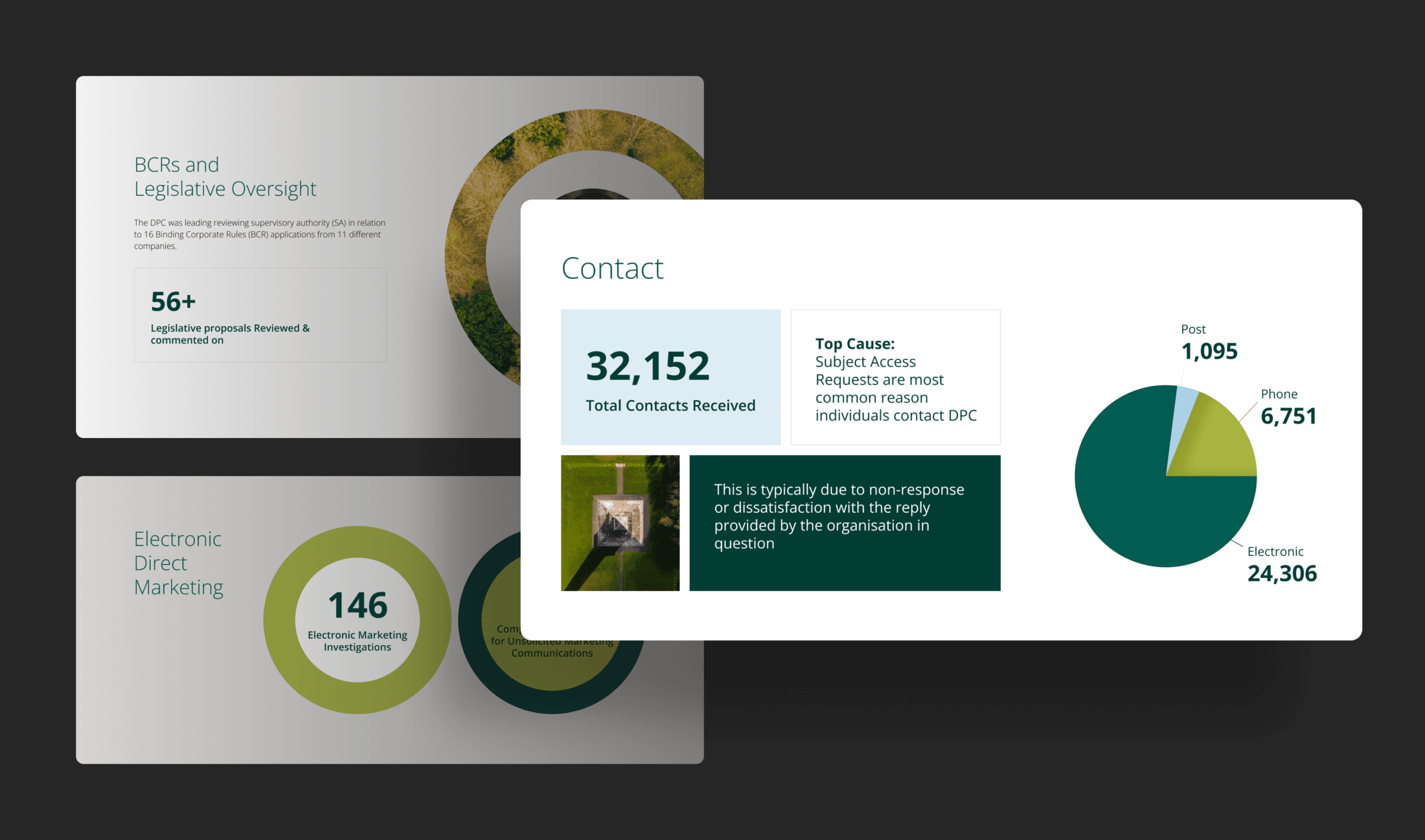
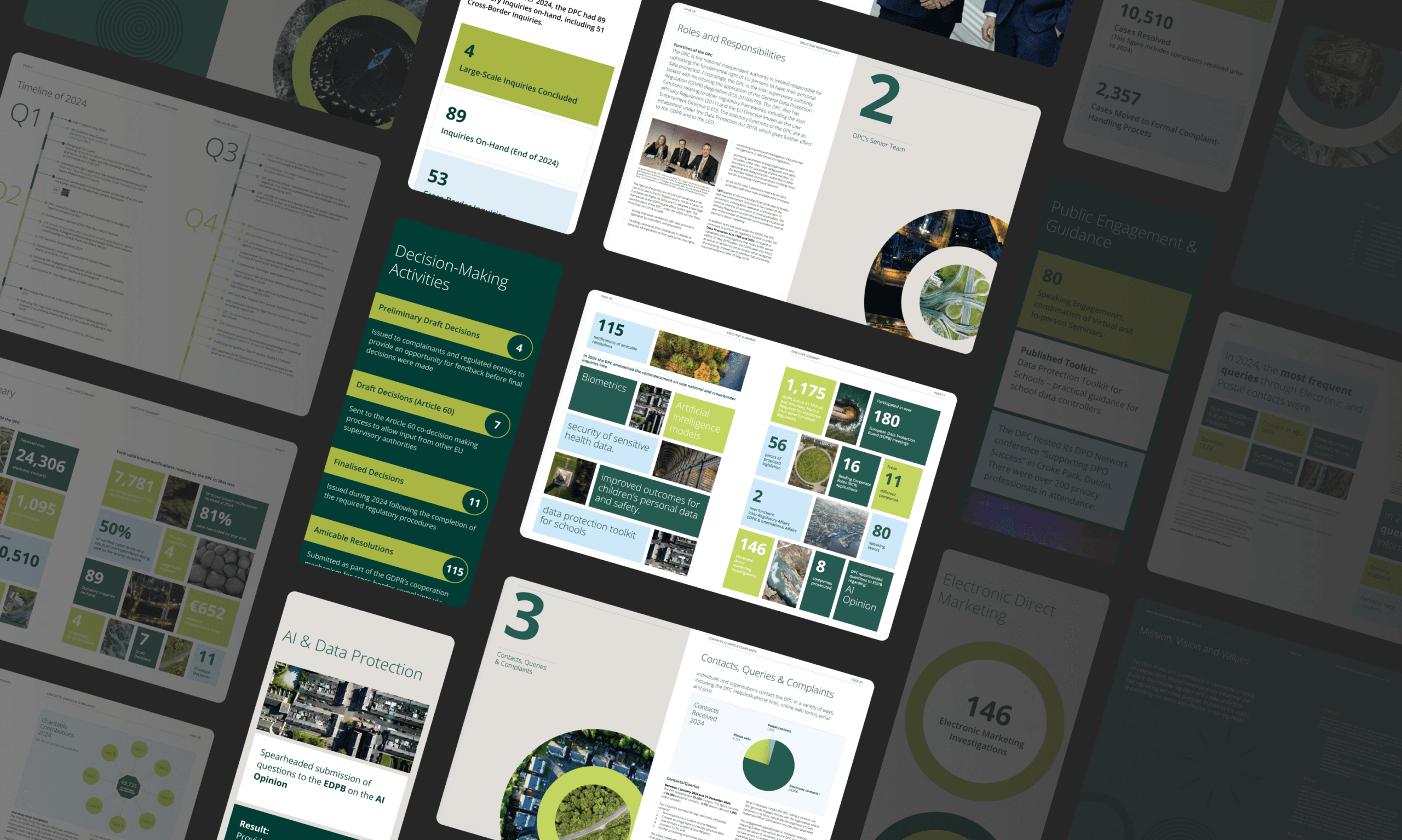
We started with the report itself. Instead of the usual wall of text, we redesigned it as a proper visual publication, closer to a magazine than a filing, with the kind of layout, imagery and pacing that actually pulls a reader through a page rather than daring them to keep going.
Fines, inquiries, breach numbers, all the stuff that normally gets buried in paragraphs, now sits up front where it belongs. It’s the same content, but it finally looks like something worth your time, whether you’re reading the printed copy or the PDF.
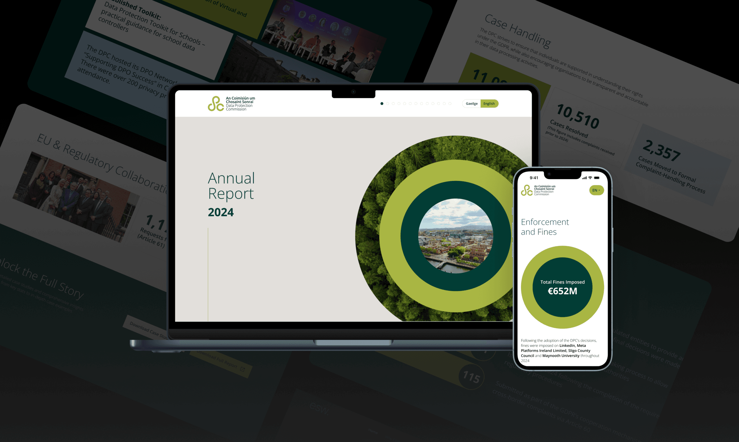
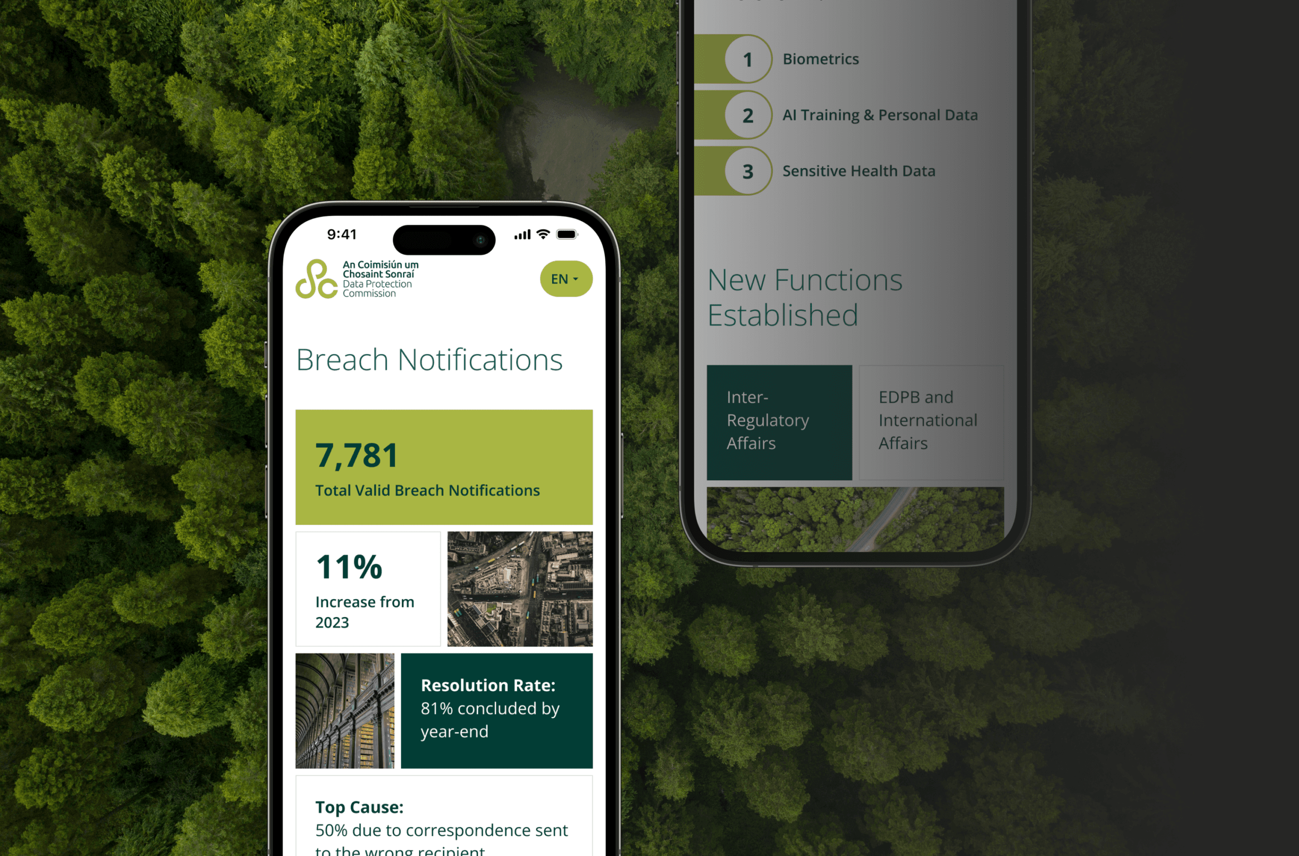
Once the report was sorted, we built a companion for it: a single-page microsite that gives people the executive summary on the go. It’s built to be read in a couple of minutes on a phone, using the same visual language as the report so the two feel like one continuous piece rather than two separate projects. And for anyone who wants the full detail after that, there’s a one-click download of the complete PDF right there on the page.
Where the printed report is the full, considered read, the microsite is the snapshot, something to open on a phone between meetings and still walk away with the headline numbers.

We started with the report itself. Instead of the usual wall of text, we redesigned it as a proper visual publication, closer to a magazine than a filing, with the kind of layout, imagery and pacing that actually pulls a reader through a page rather than daring them to keep going.
Fines, inquiries, breach numbers, all the stuff that normally gets buried in paragraphs, now sits up front where it belongs. It’s the same content, but it finally looks like something worth your time, whether you’re reading the printed copy or the PDF.
Once the report was sorted, we built a companion for it: a single-page microsite that gives people the executive summary on the go. It’s built to be read in a couple of minutes on a phone, using the same visual language as the report so the two feel like one continuous piece rather than two separate projects. And for anyone who wants the full detail after that, there’s a one-click download of the complete PDF right there on the page.
Where the printed report is the full, considered read, the microsite is the snapshot, something to open on a phone between meetings and still walk away with the headline numbers.
Contact us today to discuss how we can create refreshing User Experience and keep your audience engaged.
Contact Us