
UX and Conversion Centric Design – Striking a Balance
You may have heard of user centric design but what about conversion centric design…
What is a conversion?
We’ll start with the basics; conversions are “any desired actions that a user performs after receiving some form marketing messaging”. These conversions can come in many forms but we typically associate them with actions such as purchases, bookings, quotes, signups etc.
These can fluctuate broadly across industries but ultimately it’s an action that contributes to your bottom line to some degree. So naturally, you want your website to be designed in a way to maximise these actions.
Influencing Behaviour
From an academic point of view, marketing boils down to 3 key elements of attitudinal psychology:
- Cognitive
- Affective
- Conative
In layman’s terms, marketers are trying to influence their target audience at different stages of the purchase cycle. Cognitive refers to whether or not an individual can recognise a product or brand. So the typical associated marketing goals here are to drive brand recognition and awareness.
Affective refers to a consumer’s emotions or feelings about a particular product or brand. These can be influenced by cultural and moral factors as well as a person’s beliefs and values. Brands can try to evoke certain emotions in their content strategy or advertising to shape these perceptions.
Conative refers to the likelihood that an individual will undertake a specific action or behave in a certain way towards a brand. This typically refers to purchase intent.
Although all three are interconnected, generally when we speak of designing for conversions we want to directly influence people to perform actions. So the third stage is the important one here, we want to influence people’s conation.
As a digital agency, we work on many different web-based projects with a wide variety of clients with different needs. From the outset, we try to understand what the most important business goals for any given client are.
Getting the goals right at the start is critically important and sometimes this is not a simple as it sounds. The key goals will narrow down exactly what could and should be included in design to deliver the best possible user experience.
Speaking of UX, it certainly is a hot topic of late. Lots of agencies are adopting user centric design to streamline services making completing tasks or finding information for their customers quick and easy. All this sounds great and forward thinking but it can actually work to the disadvantage of the business in some cases which I will delve into.
The difficulty arises when trying to strike a balance between aesthetic design and good UX with sales and marketing objectives (conversions). However, there is no reason why this equation can’t be solved with the right approach and processes.
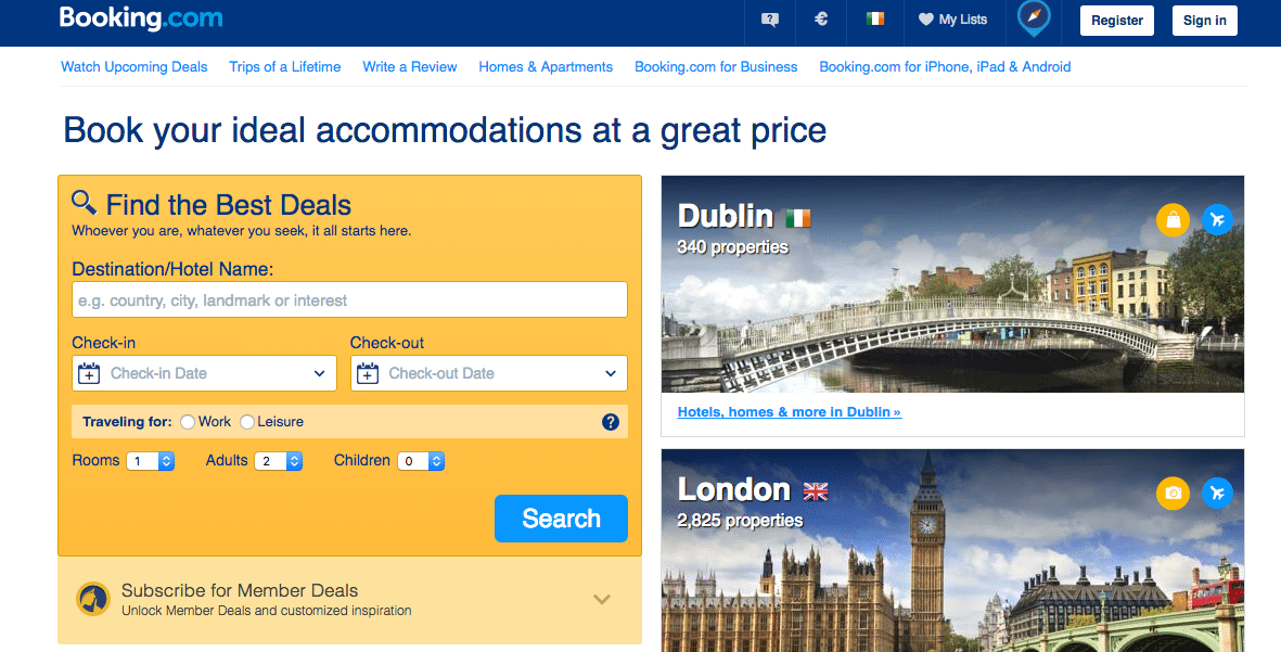
For example, some designers like to use burger menus on desktop to hide the navigation giving more space for images and design elements.
This could potentially cause significant UX problems with your site. This is not to say burger menus should be avoided at all costs, but rather you should test if your users will be comfortable with it.
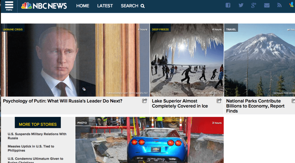
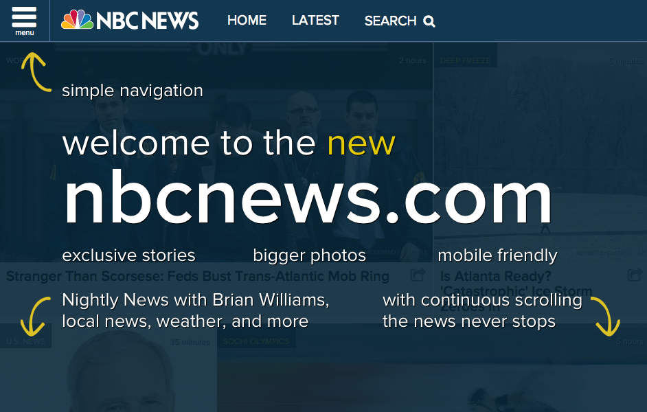
Here’s an example of how NBC news introduced a burger menu in 2014 and had to add instructions because no-one could find it.
They ended up removing it entirely and returning to standard navigation. Lesson learned — think before you munch that cheeseburger.
Or at the other end of the scale Marketing & Sales Managers may want a full-screen popup to encourage users to sign up for a free trial. Be careful with this, you will drive users away if you are too intrusive.
Here’s an example of how conversion design can go over the top. This popup appeared on the homepage of a marketing agency’s website after about 10 seconds.
Obviously, inquiries are a key marketing objective for this company but surely a prospective client would want time to read the content on the page? Plus if they want to contact you they will probably look for the contact us page.
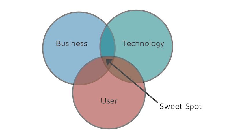
Some designers (or client stakeholders) feel strongly that their ideas and concepts are best. While they often are creative and impressive they may not necessarily help the business achieve the objectives.
Sometimes new technology such as 3D graphics or complex transitions & animations can look impressive but don’t really help the user or the business at the end of the day. You should always strive to find the “Sweet Spot” of the three players.
Principles of Design — How they apply to conversions
I recently attended an inbound marketing conference where one of the speakers was Oli Gardner the Co-Founder of unbounce.com. He has written extensively about conversion optimisation for landing pages and about design principles in particular. He talks about conversion-centric design as opposed to user-centric design.
Where user-centric design which aims to help users find info ASAP conversion-centric design does the opposite in some ways. It strips away unnecessary distractions to increase the likelihood that a user will complete the desired action.
Obviously, there are many principles of design but I want to talk about 4 principles that can be utilised to increase conversions.
1. Direction
If you want someone to go somewhere, point them in the right direction. Directional cues help to guide users to concentrate on certain areas of a page (your CTA). For example, using arrows can be effective in some circumstances like on landing pages that direct users to forms.
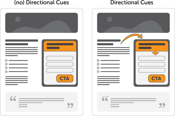
Or you could take a more subtle approach and use eye direction, finger pointing, lines and curves to direct users attention to the desired area.
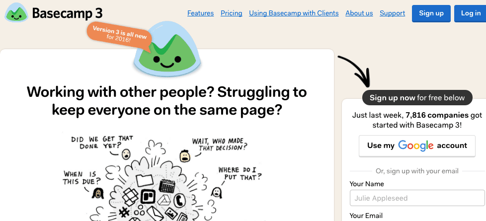
Here’s an example of how eye direction leads you to the free trial or video
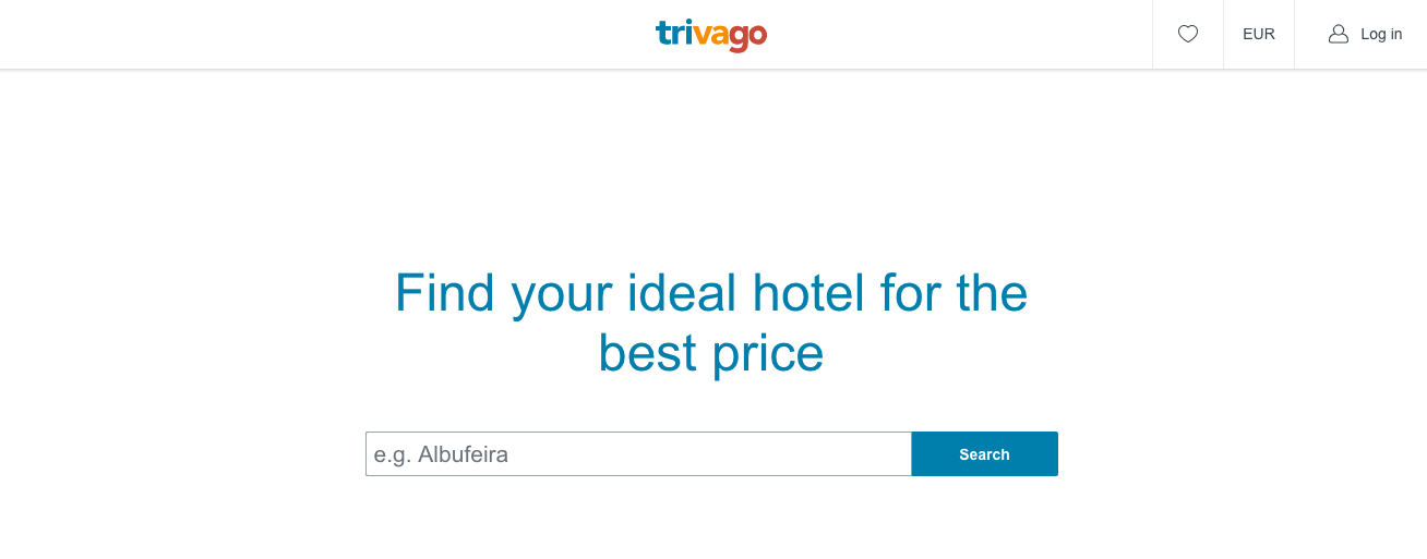
2. Whitespace
Ever look at a web page and there’s too much going on? It’s probably due to a lack of whitespace (too much content). Increasing the amount of blank space (it doesn’t have to be white) around your CTA will help it stand out. Just look at how simple Google is.
Below you can see how the Download button stands out due to the space around it and contrasting colours.
Trivago also copy Google approach quite well
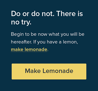
3. Encapsulation
Encapsulation refers to using a container to highlight a point of interest. The idea is to create a sense of tunnel vision to focus the user’s attention on your CTA. In practice this could be something like putting a contrasting border around a form.
4. Colour & Contrast
Colour and contrast are very important to make key links or buttons stand out and be found easily. You need to be as clear as possible and do the thinking for your audience. The dominant colour of your web page will influence what works best.
Similarly appropriate font colour, weight and size can impact your conversion rate. I’m not going to list all of the colour pairings but here are a few examples:
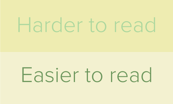
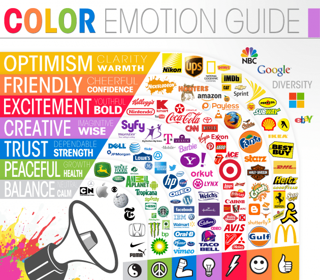
Another point to mention is colour actually affects us emotionally. So bear this in mind when making a decision.
Tools to Help You Design For Conversions and Improve UX
Now we can’t expect all marketers to know everything about design and vice versa. However, there are handy tools which marketers can use to help illustrate their concerns to designers and management.
A/B Testing
A/B testing is great way to quickly discover whether your site’s design is optimised for conversions. By asking users simple questions about your current design vs designs that incorporate the principles I’ve mentioned, you can arm yourself with data.
You can then take this data to your boss, CFO, manager etc. and tell them “X amount of people found this change beneficial” this could lead to X percent more sales. Now you’re speaking their language, and you’ll get that extra budget you need.
Question Test
Usability Hub have some great tools to perform some basic UX testing (And it’s free if you participate in other users tests!) The question test allows you to show users one of your web pages and ask for example “what would you expect to do on this site?” See below:
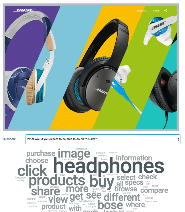
You can use this test to discover any weakness in your websites design or to test out a new landing page you have created. Any major flaws will be quickly identified.
Click Test
Say for example you think that changing the colour of a signup button or moving it to a different place that you feel is more prominent will increase conversions. You can set up a click test and compare how easily users found the button.
To set it up just take a screenshot of the current page upload it, then upload a slightly edited version with the changes (if you don’t have any photo editing software you can use https://pixlr.com/editor)
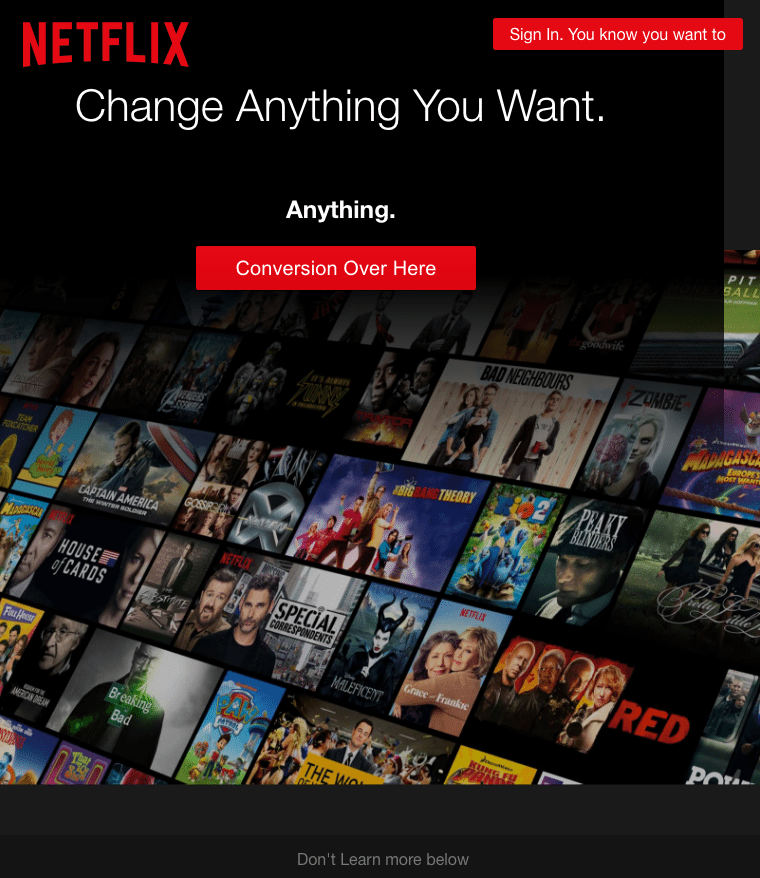
Edit Any Web Page Like a Word Doc.
One of my favourite tools which can help you to edit web pages with absolutely no coding experience, is this nifty piece of javascript. Simply paste the below code into the address bar any web page you are on (retype javscript: after you paste it. Chrome is weird.)
javascript: document.body.contentEditable = ‘true’; document.designMode = ‘on’; void 0
And voila! You can now mess around with any web page as if it was a word doc. Change the text, increase spacing, delete sections, move buttons. You can then use your edited page to perform some of the tests I mentioned without having to get designers or developers on board.
Here’s an example of what you can do:
So to round up there are some key questions you need to ask yourself to understand whether you are getting as many conversions as possible:
- Is my conversion rate high enough?
- Does my website meet key design principles?
- Is my website design and content focused on the primary action I want the user to take?
- Have I tested my website with my target audience?
- Are the next action points clear for the user?
If you answered no to any of these question you may want to consider a website redesign or UX audit at the very least. User experience is one of our specialities so don’t hesitate to get in touch.


