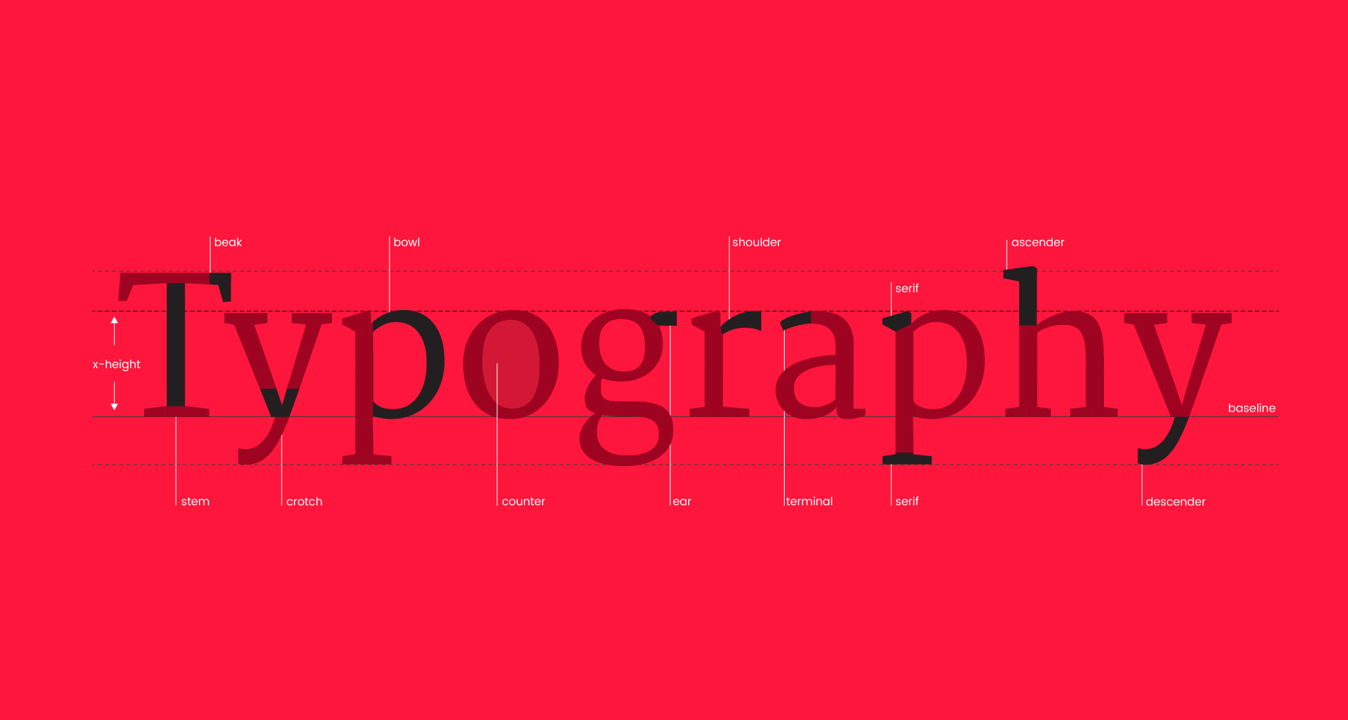

How important is typography in web design? Very. Your website is an extension of your brand, and its typography dictates the personality. A customers perception of a site can be transformed by typography. If we take our site as an example, you can see how a few quick updates to the font type can dramatically alter the feel of the message.


Many businesses have clear guidelines in place for the use of their brand elements. However the majority of brand guidelines I’ve come across have detailed guidelines for print applications, but little or no consideration for application on the web. Often fonts designed for print don’t render well on screen. Legibility considerations are different too, Serif fonts are easier to read in print, (all newspapers use serif fonts), but on-screen sans-serif is more legible.
If your brand uses a serif font for body copy in print, translating this literally to the web may not be the best idea. For headlines, serif fonts can look great, but for large amounts of body copy on the web, sans-serif fonts are generally regarded as the best choice.
Choosing a font
Gone are the days when we were restricted to less than 20 ‘web safe’ fonts. Modern web design allows for almost any font to be embedded into your site, assuming you have the correct usage rights, (more on that later). While there are many other factors to consider when designing for the web, font choices can have a massively powerful impact. The font choice needs to reflect the personality of the brand, is it strong and bold or light and airy? How do the characters flow in a paragraph or as a headline?
Often we chose a different font for headlines and body copy, as you can afford to be a bit more creative with a headline font. If going down this route, you need to make sure that the chosen selection of fonts compliment each other. The interplay between two fonts can create its own mood, and mixing fonts can create a more unique and recognisable treatment when used consistently. A picture paints a thousand words, and the typography masters at Hoefler&Co have illustrated here how different font combinations can create very different moods. There are no set guidelines for mixing fonts, this will depend on trial and error, and can be one of the most crucial points of the design process.
Web designers need to consider practical issues surrounding font choices too. How the font will render in browsers? How it will work in the flow of a paragraph? If the site is translated, will the font be able to cope with special characters and ligatures? Are the necessary styles and weights available for the font? You’ll likely want to use bold and italic text in the content of your site, not all fonts come with specifically designed styles for these.
Font rendering in Chrome (Mac)
Font rendering in IE9 (Windows)
Considering your layout
So assuming you’ve got your font choices nailed, they compliment each other, they’re flexible and comprehensive, they embody your brand. Everything’s going great… but wait! There are more pitfalls that can make or break the typography of your web design. Layout, colour, spacing… The list seems endless. But each point really does need to be considered in the design stage.
Unfortunately, in web design we don’t have the same fine control over kerning (the individual spaces between letters), as you do in print design. This makes font choice all the more important, as you’ll want to choose one that flows nicely in a sentence. Some free fonts you’ll find online don’t have the same high-quality attention to detail as a professionally designed font, so don’t be tempted by the wealth of free fonts out there, sometimes it’s worth spending a relatively small amount of cash to get a great font, a resource that your company will use every day.
Leading (the vertical spaces between sentences) is something that I feel is largely overlooked in web design. Personally, I’m a fan of large leading in content, but that largely depends on the shape and style of the font. I’ll always play with the leading of my typography when designing for the web. It can transform the look of a block of content. I’ll always tend to adjust to for mobile devices though, as you don’t want a high amount of leading increasing the length of your content dramatically on a phone.
Web Design Colour Considerations
I’m a big fan of subtle colour variations in web design personally, but I always need to be careful that the contrast of my font against the background is high enough. While a design may look great on my screen, if I look at it on another monitor the contrast may not be as high, either due to the hardware or brightness settings. While it’s great to get creative with colour, the design will be a failure if the content is difficult to read. So up the contrast as much as you can. Personally though, I always stop short of going with full contrasting colours.
On a white background, I favour a rich dark grey over a black. I’d never put white text on a black background, the contrast is too stark, I’d always move towards a light grey, or pale tones of the main brand colours to keep the contrast clear but not too severe on the eye. It’s a fine balance, but it’s a great feeling when you get your colours spot on!
Usage Rights
Here at Friday, we love the free and robust Google fonts API. A massive range of high-quality fonts are available and can be coded into your site quickly and easily. Being a Google product, the Google Fonts system is constantly updated, and in my opinion, nothing matches it in terms of speed or reliability. Fonts can also be downloaded, so using them in the design process in Illustrator or Photoshop is a breeze.
While not free, Typekit provides access to a wider range of fonts, and often high-quality foundry fonts. It’s a subscription service and can be integrated into Adobe Creative Cloud, for easy designing. When existing brand fonts are required, Typekit is often the solution.
If you have a font that you want to use on the web, but it’s not available through Google Fonts, or Typekit, the font file can be embedded on your webserver and embedded using the @font-face CSS rule, independently of any web service. @font-face is supported by almost all modern browsers. The drawback is that when your font is loading on the page, the user may see a default web-safe font for a second or two. When using @font-face, make sure you have the correct rights to use the font on the web, you may need to purchase a specific license for web usage.
As you can tell at this point, designing typography for the web involves much more than ‘just picking a font’. I haven’t even touched on the issues surrounding accessible web design here, that’s a topic for another post.
Have any thoughts on Typography? Feel free to start up a discussion in the comments below!
With a background in design, Mary has morphed into one of our lead developers here at Friday, developing expertise in display advertising and motion graphics along the way. Basically - there's nothing she won't get stuck into given the chance.