
Bootstrap V4 is coming… soon we think
Most of us are aware that Bootstrap (or Twitter Bootstrap as it used be know) has been around for a long time now.
Editors note: For those not familiar with Bootstrap, in a nut shell, it is a bunch of sample code and templates, that allow developers to quickly build websites that resize to the screen size of the device the user is using.
Started in 2011, it has gone through two major iterations so far – Bootstrap v2 and the current version – v3.
Bootstrap 2 added responsive functionality and Bootstrap 3 took the responsive revolution one step further with its mobile first approach while also getting on the flat design bandwagon.
The next milestone
In August 2015, Bootstrap released their first Alpha release of v4. Since then a year and 5 months has passed and we still don’t have a stable release of v4.
According to their official blog, they are now at Bootstrap 4 Alpha 5 but they still “have a lot of work to do” before getting to a stable release.
So is 2017 going to be the year of Bootstrap 4? Time will tell I guess..
What’s new in v4?
Version 4 promises lots of new features including a switch from less to sass; improved media queries, flexbox support and a redesigned grid. Head over to their blog for more details about all the new bits and pieces.
The Grid gets a new breakpoint.
The grid in Bootstrap 3 was made up of 4 breakpoints – xs, sm, md and lg. The most problematic of these breakpoints for designers was ‘xs’ which kicked in at 768px in width. This breakpoint was way too early for a lot of modern mobile phones and tablets with bigger screens. The result was content filling the full width of the screen when it looked like it shouldn’t. This looked particularly awful when you introduced responsive images into the mix.
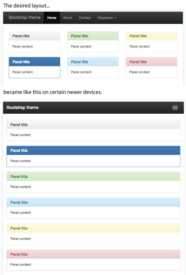
To solve this problem, Bootstrap 4 will redefine the breakpoints in their grid system. Rather than adding a ‘xxs’ class, they have moved all the tiers down a level so that the lowest level now now starts at 667px rather than 768px. The new ‘xl’ tier will replace the existing ‘lg’ tier, giving the designer a wider range to play with.
Check out the document for more info about the new grid system.
Panels are out; Cards are in.
A card is a flexible and extensible content container. It includes options for headers and footers, a wide variety of content, contextual background colours, and powerful display options.
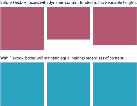
The nice thing about the new cards is that they use css flexbox which allows you to create groups of cards that maintain the same heights. Before flexbox it was very difficult to get columns of boxes with different amounts of text to look good across all devices. You would end up with variable heights on a lot of your columns.
Browser compatibility
Bootstrap V4 will support the latest versions of Chrome, Safari and Firefox. On Windows, they will support Internet Explorer 9-11 and Microsoft Edge. Support for Internet Explorer 8 is to be dropped which is no harm as only about 0.3 percent of people use it.
The end of Bootstrap v3 style templates?
Whether or not bootstrap 4’s new changes and features will motivate designers to come up with new ways to showcase the power of bootstrap will remain to be seen. Perhaps 2017 will lead to a new bunch of design trends that make the generic bootstrap themes a thing of the past. We will wait and see.
Thanks so much for reading and if you have any thoughts about what Bootstrap V4 will mean for web design in 2017, let us know in the comments section below.
Jonathan is a UX Developer here at Friday. Since graduating from IADT with a BSc (Honours) in Computing Multimedia Systems & Web Engineering, he has been passionate about improving and expanding his skill set in all things web development.